Pages

Tuesday, September 30, 2014

My sweet 15 year old

Hey everyone, Amy here to share a layout I created using the spin cycle cut file. I am pretty sure it's my new favorite cut file EVER! I love that it allows me to use plenty of fun patterns and embellishments on my page. I was able to use up most of my September kit from Paper Camellia along with some fun bits from Chic Tags new Storyteller line.


Here's some closeups.


Make sure you check out all the fun cut files in the shop that Ashley has created.


Monday, September 29, 2014

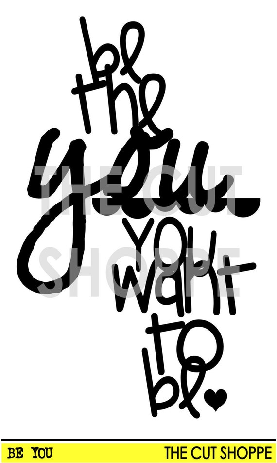
Be the you you want to be

Hey everyone, Michelle G here today with a fun and bright LO.  I tend to shy away from bright colors but once in a while I dare to go bright and I always love my LO when I do.  It's always fun to step out of your comfort zone once in a while!


A few close ups of the files:


Here are the fun files I used on my LO:


Did you know that new files are added to the store every week?  Make sure to check back often!


Sunday, September 28, 2014

Just Saying

Hello everyone! Here is Cari with my last layout with the kit from Clique Kit. The set of cuts that  Ashley created for this blog hop inmediately turns into ones of my favorites ever so I made a lot of  layouts with them and I now I will keep using it for sure.

In this time I used 3 talk bubbles from "The Just Saying" cut and added some tape on the back to make them look blue and glittered.

   
I love how it looks like my niece where talking LOL. This cut it also reminds me "The Fault In Our Stars" cover.


You can get The Just Saying cut here and you will get all four bubbles!


I hope you like it!!
Kisses 

Saturday, September 27, 2014

Hi everyone,

It's Michelle W here with another layout using the gorgeous September Clique kit, Study Abroad and the following two cut files.

My layout:

 I have also used two cut files from The Cut Shoppe - the 'Think Less Live More" and the "Flash Cards 3x4" cut files.  I first used the 'Think Less Live More' phrase as a border strip to create visual interest down the left hand side of my layout.  I do really love using the word 'hello' on my layouts and incorporated this cut file into my title.   To do this - I cut the 3x4 flash card out with the 'hello' on it (enlarging it first) and then removed the border frame from it so I was just left with the word itself. I then misted the word with a yellow mist and outlined the word and speech bubble in black pen.  

Details:
Thank you so much for stopping by today - I hope I have shown you how versatile the Cut Shoppe cut files can be.  Take care 


Friday, September 26, 2014

Live Simply

Hi Cut Shoppe Fans,

Gina here today to share a layout that I made using two new cut files from the shop.  I have been in awe of all of the projects that I have seen lately in the scrapbooking world using the new hand cut lettering trend.  I was so excited when Ashley decided to add this adorable alphabet to the shop.

Here is the layout that I created using the new Now I Know My ABC's alpha.


Live Simply


My layout was inspired by a quote that I found on Pinterest.
How To:  I added some watercolors to my white background paper and then adhered my title using repositionable adhesive.  I used a ruler to make sure that my title was straight and then used a sewing machine to stitch the letters down.  I added a few embellishments, Funky Florals flowers and photos.  I finished by dropping a few flicks of black paint on the page.


Here are the cut files that I used on my layout:


Make sure that you stop by The Cut Shoppe and pick these fun cut files up.  I know that I will use these files over and over again and I'm sure you will too!


Thursday, September 25, 2014

Sugar & Spice and New Cut Files!

Happy Thursday everyone!  It's time to take a look at the new Cut Files that have been added to The Cut Shoppe today!  Five new sets have been added, and I created a layout today, using the And Then 12x12 background cut file and the Now I Know My ABC's alpha cut file!


https://www.etsy.com/listing/204748627/the-and-then-background-cut-file-is?ref=shop_home_active_5

https://www.etsy.com/listing/204750217/the-now-i-know-my-abcs-cut-file-consists?ref=shop_home_active_1

I used the And Then background cut file, over a bright, striped patterned paper!  I love the look of the positive and negative Ampersands, with the pops of color showing through.  And if you've been loving the hand-cut alpha look that's been popping up lately, but just don't feel comfortable cutting your own letters, then the Now I Know My ABC's cut file is perfect for you!  You can get that hand-cut look for your titles, just by cutting the letters out on  your die cut machine!  Easy Peasy!  

And if you're wondering where the cute products are from, that I used for my layout, then check out the new monthly Kits from Felicity Jane!  This is the first Kit release, Charlotte, and it has some amazing papers and embellishments!

You can also visit The Cut Shoppe, to check out the other new cut file sets that have been added today!  And don't forget to sign up for our FREE Weekly Newsletter!  Newsletter subscribers receive weekly info., exclusive FREE cut files and exclusive shop Coupons!!

https://www.etsy.com/shop/TheCutShoppe?ref=ss_profile

Supplies:  And Then 12x12 cut file, Now I Know My ABC's cut file: The Cut Shoppe; Patterned Paper, Wood Veneers, Printables, Stamps & Flair Button:  Felicity Jane; Color Shine:  Heidi Swapp; Tiny Attacher:  Tim Holtz; Die Cut Machine:  Silhouette Cameo

http://www.ashleyhortondesigns.com/

Wednesday, September 24, 2014

Fall Days Layout

Happy Wednesday everyone!  It's Lee-Anne here and today I am sharing my layout at The Cut Shoppe and now that it is the beginning of Fall, I thought I would create a Fall layout of this handsome little cutie who is my daughter's nephew.


I used the Free Falling Cut Files to create the title of my layout, the leaves and the trees behind the journaling tag.  I love all the texture these cut files give the layout.  I also used some stickers and patterned paper from the Indian Summer Collection by We R Memory Keepers and flair from A Flair For Buttons.  To add a little more depth to the background paper, I used several stencils and some distress inks to give more interest.  Below are a few closeups…


Here is the cut file I used from The Cut Shoppe


I hope you are inspired with my Fall layout.  Thanks for stopping by and check out all the amazing digital cut files in The Cut Shoppe here.   


Tuesday, September 23, 2014

Arcade Fun

Hi everyone, it's Danielle here with you today! Because of our fun team up with Clique Kits this month, I decided to make my layout for this post with their September Study Abroad kit.

I started the design of my layout with the Right on Target cut file, randomly placed the three pictures over it and clustered them with paper, vellum and Pinkfresh Studio enamel frames. To each cluster I added one of the files from the Going Geo and Notebook Doodles cut files.


Thanks for stopping by and enjoy your day!