Pages

Tuesday, June 30, 2015

Hello Summer Love


Hi everyone!  It's Gina here and I have a new layout to share with you today using the free Newsletter (Summer Love) cut file and the Bitty Borders cut file

Here's my layout:


I'm in love with that Summer Love cut file.  I knew right away when I saw it, that I just had to use it right away.  To create my layout, I actually cut the Summer Summer Summer Love title twice.  The first cut was the full title and then I trimmed off the bottom (love) piece.  The second cut I only cut the word "Love" from white cardstock paper.  I then placed the "Summer Summer Summer" title right above the love cut piece.  I placed my photo behind the love word.   To add color to my page I added watercolors on two of the Summer words and behind the title, before adhering down.  


The small circular hearts are from the Bitty Borders cut file, I simply ungrouped them and then cut them out individually and added watercolors to them.  To finish off my layout I added black spray mist, wood veneer pieces and machine stitching.


Summer Love


I hope this post has inspired you to try watercolors on a layout. It really adds a lot of color and interest!  Have a great day!


Monday, June 29, 2015

Every Picture Has A Story

Happy Monday everyone! Hope you had a great weekend! This is Sheri and I'm here today to share a new layout with you. I love the cut files on this one and the title was perfect for the occasion.

I wanted to capture the first time my grandson picked and brought me a "flower". It was so precious and he was so proud. I'm just glad I thought to grab my phone and take a quick picture as he was handing it to me.

Here's my layout:


For this layout, I used four different cut files. The first one is what I used for the title. It's from the "Stay Focused" set. The arrow next to the title was cut from the "Target Practice" set. This is one of my favorite sets because it is so versatile. I print a lot of the elements in this set to use on Project Life and fillers for layouts.


The third was from the same set "Stay Focused" and it was the round "Smile" cut file.


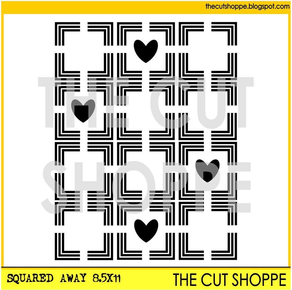
The fourth cut file was the background behind the photo. It is called "Squared Away".
I used the 8 1/2 x 11 size since I was cutting it down to 9 squares. This allowed for the hearts to be in even squares.


I hope this inspired you to try multiple cut files on a single layout. It really adds a lot of interest and just an extra touch!  Have a great day!

(NOTE: I do have a process video for this layout however I have lost my voice so I'm not able to complete the narration. Boo! Anyway, I will get it uploaded as soon as I have my voice back and can talk again!)


Sunday, June 28, 2015

Fabulous

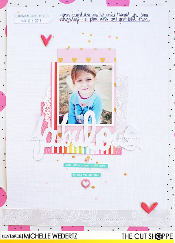
Hello! Michelle here with you today and I am very happy to be sharing a new layout I made using the recently released This & That cut file from The Cut Shoppe.


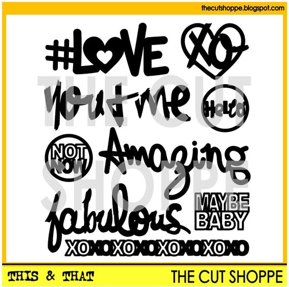
The This & That cut file set includes 9 miscellaneous icons, that can be used on your scrapbooking and paper crafting projects.

When I first saw this set of cut files, it instantly became one of my favorites. I am a big fan of fun titles and these are just perfect! So perfect, in fact, that I had a hard time choosing! When I was finally able settle on a choice, I knew I wanted to create a sort-of tone-on-tone effect with it. Here is what I came up with:

Fabulous

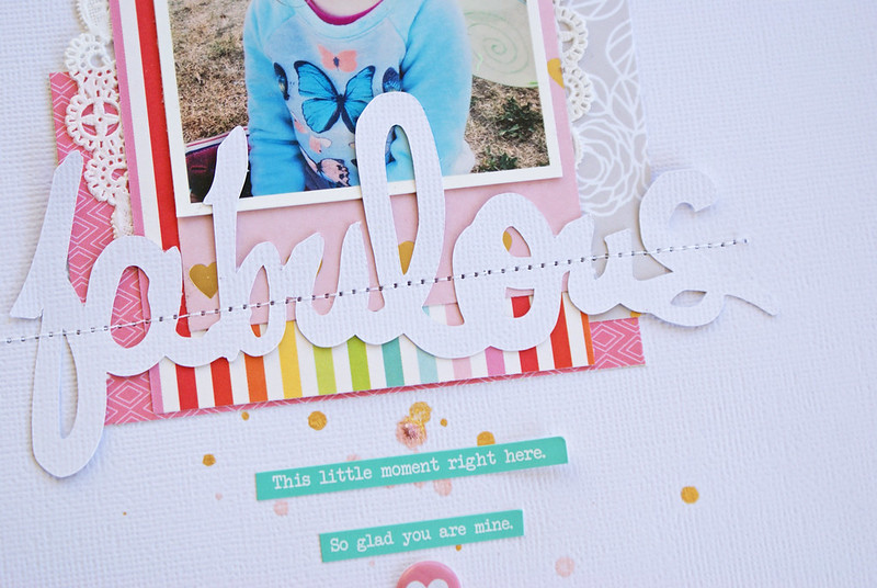
I had initially decided to layer the "fabulous" right on top of the white cardstock background to give a true tone-on-tone look to my title, but as I was playing around with my design, I found that I rather liked how it looked layered on top of the colorful papers.

Fabulous 2

As I do almost 100% of the time, I anchored the "fabulous" by running it through the sewing machine using white thread.

Fabulous 3

This layout has certainly become one of my new favorite layouts. All the beautiful colors combined with lots of white really makes both the title and patterned papers shine. Wishing you a fabulous day!

CS Blog Signature

Saturday, June 27, 2015

So Happy Together


Hi everyone!  It's Gina here and I have a new layout to share with you today using the Tiny Triangles background.  Eye catching backgrounds are my groove.  I love pattern piecing and using lots of geometric shapes.  When I first saw the Tiny Triangles cut file, I fell in love!


When I started working on this layout, my original plan was to cut out the whole background from cardstock and then back the pieces with different pattern papers.  I accidentally had my cut settings on the wrong setting (I think I had it on patterned paper, when I really meant to have it on cardstock).  So, the Tiny Triangle design did not cut all the way through my cardstock.  I thought about starting over, but it was my last sheet of Navy cardstock.  So instead, I cut out individual triangles from various patterned papers and placed it on top of some of the background triangles.  It was a happy accident, I love that even though the background design did not cut all the way through, you can still see the design against the dark navy background.


Have you ever made a mistake on a layout and then turned it into a happy accident? If so, we would love for you to share it with us on our Facebook page!


Friday, June 26, 2015

13.1

Good morning, everyone!  Kat here, today.  HAPPY FRIDAY!  Before the weekend kicks off, I wanted to pop in and share a new layout with you.

I've had these photos of my friend and I laying around for awhile, but was having a hard time figuring out how to scrap them.  The pictures are from a half marathon that we ran last year and when I saw the "Running the Race" cut files, I knew I had finally found what I needed to scrap these photos!  I also combined the files with the new "This & That" files and some stars from the "I Heart String Art" file.  Here is the end result:


The stars from the "I Heart String Art" file are quickly becoming one of my favorite things to put on a layout - they are so versatile!  For this layout, I misted them with some gold Heidi Swapp color shine and topped them with some glittery gold chipboard stickers.

And here are the files I used:


Thanks for stopping in - enjoy the weekend!!!


Thursday, June 25, 2015

#Throwback Thursday | I Am Supa Fly

I love doing TBT, here on The Cut Shoppe Blog!  It gives me a chance to play with some of the cut files, that I may not have used yet, or ones that I haven't used in a while.  Today, I went way back to one of the first backgrounds that was added to the Shop when it first opened.  I wanted to use some acrylic paint with the I See Chevrons background, to create my own Ombre designed background!


https://www.etsy.com/listing/191878478/the-i-see-chevrons-cut-file-is-a?ref=shop_home_active_12


I cut the I See Chevrons 12x12 cut file, from scrap cardstock and used it as a stencil for adding the acrylic paint.  I also used the Hero Up cut file set for part of my title and the Pow burst, added next to the photo.

https://www.etsy.com/listing/209889393/the-hero-up-cut-file-includes-6-hero?ref=shop_home_active_8
 
If you would like to check out the way I used the I See Chevrons cut file for a stencil and added the acrylic paint in an Ombre look, make sure you check out my new Process Video!


Supplies:  I See Chevrons cut file & Hero Up cut file: The Cut Shoppe; Patterned Paper, Stickers, Bradz, Wood Veneers, Chipboard, Bits & Enamel Dots:  Simple Stories; Acrylic Paint:  Reeves; Color Shine:  Heidi Swapp; Die Cut Machine:  Silhouette Cameo

http://www.ashleyhortondesigns.com/
 

Wednesday, June 24, 2015

Summer Lovin'

Hey there, friends!  Missy back with you today.  I'm sharing a layout full of Summer fun!  I used two different cut files for this page:  Picture Perfect and Let's Do Summer.  I just love scrapping pool photos, so I really had a great time putting this one together.

Here are the cut files I used:


Here is my layout.  I used the beautiful Simple Stories Summer Vibes collection.  I started by resizing the oval frame into more of a round circle shape.   I took a foam brush and some acrylic paint and made a messy circle on the white cardstock.  I wanted it to look like pool water, and it wound up matching the water in the photo perfectly.  I backed some of the open spots in the die cut with patterned paper and then stitched the frame down.  I cut the title on two separate pieces of patterned paper.  The rest is just layering and embellishing.


I also added some acrylic paint splatters...I love how bold they look.  I just watered down the paint a bit and splattered it from the brush.  I used some patterned paper and tissue paper under my photo and used several embellishments around this area.  I love how the die cut looks placed over the painted circle.


Here's another look at the stitched die cut, layers and journaling.


I really love how the paint looks behind the die cut.  I love that it looks a bit splotchy...it fits the pool theme.


And here's the Summer Lovin die cut...perfect for a title!


You can check out how I put this layout together if you're interested :)  Hope you enjoy!


Thanks so much for stopping by, and have a wonderful day!

Tuesday, June 23, 2015

but first, coffee

Hello


Fearless here again, with another portion of coffee, I have realized myself that both of my projects this month relate to it, oh well, I guess we all have to have it sometimes!

this time I have created an art journal pages, they do relax me and help me to express myself, how about you? what's your favorite form of expression?


products:


have a lovely day


xoxo


Monday, June 22, 2015

Mother's Day layout

I hate to say it, but my older two have outgrown the excitement of Mother's Day.  No longer do they create some special project at school where I am invited to spend an afternoon being showered with their love.  That's when I'm super glad that I have this sweet guy to fall back on.  He did not disappoint me with his wonderful Mother's Day event at his preschool, and I couldn't wait to use the Happy Mom's Day cut file set to document it.


I grabbed the June kit from Paper Camellia to create the layout.


Here are some closeups.  I cut the flowers out several times, and then mix and matched them to make a larger bouquet.


The title I cut out of white so I could make it stand out against the background paper.


Thanks for visiting the blog, have a great day!