Pages

Tuesday, January 30, 2018

Love Love Love You with Jennifer

Hello everybody,

this is Jennifer with a new project for The Cut Shoppe!


For this layout I went a bit overboard with the cutfiles but I just had to use all of them!

I used:
Sassy Circles


Love Struck


Open Letter Alphas


Love Ya


My current scrappy motto seems to be "Use all the things!". It does help with stash busting so I'm not complaining. But that also means there's a lot going on on this layout.


I used the Sassy Circle cutfile as a background element but I only cut three rows of the circles. I backed them with a black-and-white and a pinkish red patterned papers as a contrast to my mint striped background paper.


For my title I combined the Love Struck cutfile with the Open Letter Alpha. I cut the Love Love Love from ombre cardstock that matched my striped background. My cutting machine was acting up so it didn't cut all the little circles from the Love Love Love. So I just rolled with the punches and poked out a few of the holes to kind of simulate the ombre effect of the paper. The open letters I backed with the same paper as the Sassy Circles.


I didn't want to leave the background as is and decided to add a few of the XOXOs from the Love Ya cutfile in white cardstock. It looks very soft but gives the background a certain something that I really liked.


For a few added spots of bling I added gold thread to the Sassy Circles and the Love Love Love.
I also added lots of dimension with foam dots behind the Sassy Circles, my photo and the title.

That's it for today. Thanks for stopping by and have a great week!

xoxo


Saturday, January 27, 2018

Love You layout by Jill

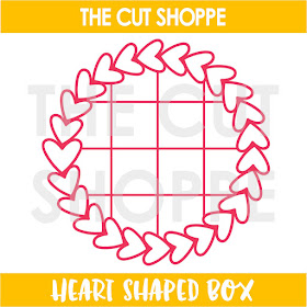
Hello!  Have you seen the new Heart Shaped Box cut file in the TCS Etsy Shop?  I had a ton of ideas running through my head when I saw this file, read on to see how I used it on layout.

I was really in the mood to do some mixed media on this layout, so I started by using spray inks and smooshing them onto my gesso covered white cardstock.  Once I reached the desired effect I cut the Heart Shaped Box file almost as large as I could with my Silhouette software.


I cut the file twice, once from solid white cardstock and again from a pale pink patterned paper.  I cut off the box lines from the pale pink paper, as they weren't necessary to my design.

I used tons of stickers and die cuts to highlight the four photos I used on this page.  The photos are sized at 2x2 inches and fit perfectly in the box cuts of the cut file!


I added in a few more stickers on the photo area... and this page was complete!


Thanks for checking out my layout for The Cut Shoppe!


Thursday, January 25, 2018

Cloud | Kelly Janes

Hey friends! Kelly here today with a new layout using the Happy Little Clouds Cut File.


I started in Cricut Design Space by using the contour feature to hide the solid cloud (on the upper left of the cut file set) so the heart would be standing alone. I then duplicated that heart image and welded the hearts to the two open clouds in the main cut file image included in this set. Next I welded the single open cloud (on the upper right of the cut file set) to the main cut file image.


I added a little blue mixed media to the clouds before peeling the cut file off the cutting mat. I cut the cut file numerous times and adhered them together to create dimension. This was easier than trying to squeeze pop-dots in the thin areas of the cut file.


I placed vellum behind the open cloud images to mute out the background patterned paper. This layout is about our cat named Cloud so I liked how the embellishments from the butterflies, to the kites, and cloud cut file just fit the theme of the layout so well!


Now you can take a look at my YouTube Process Video that also includes a Cricut Design Space tutorial.


Remember to head to The Cut Shoppe Etsy Store to check out all of the available cut files!


Wednesday, January 24, 2018

"Love You" with Enza

Hello everyone! Enza here, and today I'm sharing a layout featuring one of my favorite background cut files: Vintage Wallpaper. I love the geometric shapes and all the fun options you can go with; you can back it or leave it as it is, choose a multicolored patterned paper (like I did here) or simply go for a tone-on-tone look. If you are up to it, you can also choose a different patterned paper for every single opening of the cut file. The possibilities are endless.

Here is my layout:


I mixed and matched several Maggie Holmes' collections. I started by backing the cut file with a patterned paper that has a color-block look. It includes blues and pinks, which happen to be two of my favorite colors. After building a few layers behind the photo, I adhered it down with foam adhesive for extra dimension.


Next, the embellishments. I created two main clusters on opposite corners of the photo by layering several floral pieces, a tag and some sentiments.


The fussy cut butterflies, which coordinate perfectly with the background paper, add the final touch.


I hope you have found some inspiration in my layout today and will give this amazing background cut file a try.

Thank you for stopping by.

Sunday, January 21, 2018

"I Woke Up Like This" with Kira

Hello friends!  It's Kira and I am back with another 12x12 layout.  I decided to use one of the cut files a little differently this time around.  So instead of cutting around it, I used it as a template for some hand stitching.  And I think you'll agree that it turned out pretty awesome!


I used the Half Hearted cut file from The Cut Shoppe.  I loved the simple heart shapes (easy to stitch) and the fact that it was a background (which made it a great statement piece for this layout).  I am sure there is an easier way to accomplish this, but the way I completed this layout was but using the draw feature in Cricut design space to draw the background.  I had originally thought I would just pierce my holes and then erase the lines, but that seemed time consuming.  So instead, I placed my drawn cut file over a blank piece of white cardstock and pierced my holes through both pieces of paper. 


After piercing all of my holes, I decided on my thread.  I was planning to make this more of a Valentines Day layout, with pinks and reds as my thread, but thought I might run out of those colors if I went that route.  Instead, I chose a variety of colors that I felt would work well with the AC Paige Evans sticker book. 


I picked out seven colors because I thought there were seven hearts in each row.  There were not seven hearts in each row.  I can't count.  I didn't realize this until I had used five colors.  Oh well, the last colors I used got split between the final hearts.  It worked out in the end. 

The final result was almost to pretty to create a layout on.  Almost.  I printed out this photo of my youngest son in his pajamas that I took the other day.  We always get a little bit of alone time in the morning before my oldest son wakes up and I love that half hour or so we get to spend together.  I mean, look at that face!  Who wouldn't love snuggles on the couch with him?!


I printed the photo in black and white so his colorful jammies wouldn't clash with all of the colors on this layout.  I grabbed a chipboard pom pom frame from the Good Vibes collection, and framed his photo with that.  I wanted to make sure the photo really stood out from that busy background.  But I also didn't want to take away from the background with my embellishing.  I thought the best way to do that was to color block my embellishments.  I added a few clusters around my page, adding foam in places to create a little dimension.


I considered a title, but didn't want to add anything too large to the layout.  I found a sticker in the sticker book that said "I woke up like this" and thought it worked perfectly for this layout.  I finished everything off with a little bit of gold Heidi Swapp color shine and called it done!


Thank you so much for stopping by!

Until next time,


Saturday, January 20, 2018

My lifetime valentine with Anna Komenda

Hello everyone. Christmas is over, time to pull out all those hearts and pinks because it's time to celebrate Valentine's Day. I really like this day. I know it may be overloaded with all that glitter and sweetness but still - you can never have to many ties to celebrate love. I found my soulmate 12 years ago ans I stick to him since then.


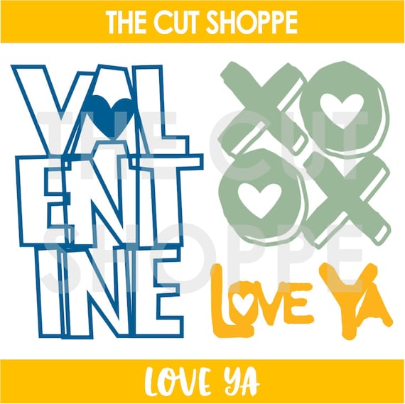
The Cut Shoppe is a real gold mine of Valentine's days inspirations with so many cute cut files. I decided to use one from the new release called "Love Ya".


I used a picture of me and my hubby from our wedding day. It was really a touching moment and I want to remember it forever. 


I cut the word "Valentine" in a big size and backed it with pattern papers. I love this technique. You can finally use up all the scraps and you get pretty and big element to embellish your page.


Pink and cute hears are always a good idea :) And this is a cut file I used:


Thank you for stopping by and see you in February.
Anna


Thursday, January 18, 2018

New Cut Files | Awesome Smile

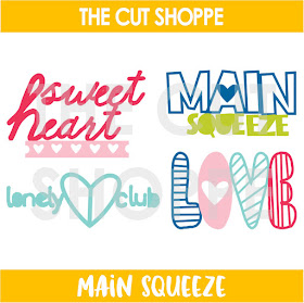
Hi there, everyone!  It's Thursday, and time for some fun new cut file sets!  We've got a great mix of designs for you today, and I decided to combine two of the sets on my layout.  I used the Heart Shaped Box background cut file and the Main Squeeze cut file.  It's always fun to layer different cut files, to help add interest to your projects!


https://www.etsy.com/listing/573367000/the-heart-shaped-box-cut-file-is-a?ref=shop_home_feat_2


https://www.etsy.com/listing/587171901/the-main-squeeze-cut-file-includes-4?ref=shop_home_feat_1


This layout has A LOT of color!  I used the Good Vibes collection from Crate Paper.  I tried a couple of patterned papers for my background, but couldn't decide what to do at first.  Then I tried adhering the Heart Shaped Box cut file to a White card stock background, but I wasn't loving it.  So I trimmed away all of the card stock and settled on the background paper you see above!  Sometimes you just have to try a few different things, before landing on the right thing!


I love a cut file that includes a grid pattern.  The boxes inside the heart wreath are perfect for adding your favorite patterned papers.  Once I had all of the open spots filled in, I added my photo.  I used one of the cute frames from the Good Vibes collection to make the photo stand out.  Then I cut the word "Love" from the Main Squeeze cut file from a contrasting patterned paper and placed it above the photo.


And grid spots aren't just perfect for patterned papers...they're also perfect for adding embellishments.  I went through the different embellishments in the Good Vibes collection, and chose a mix of stickers, chipboard and ephemera to go in each of the grid squares.  It's definitely a busy layout, but I love the way the colors and embellishments all came together!

You can find these cut files in The Cut Shoppe Etsy store along with our other two new designs!  Head over and check them out!!

https://www.etsy.com/shop/TheCutShoppe

https://ashleyhortondesigns.blogspot.com/
 

Sunday, January 14, 2018

XO with Jill

Hello Everyone!  I used the new Love Ya cut file on a Christmas layout.... YES I DID! 

I started by cutting the XO out of two-toned red patterned paper, enlarging it quite a bit so I could overlap the photo on the cut file.  I adhered this to my layout with liquid adhesive, making sure the cut file edges were nice and flat so I could hand-stitch around the XO with black embroidery floss.


The next step was building layers behind my photo, so I used tissue paper and two patterned papers to frame this SnapChat photo of my sister and my daughter.


I added this to the layout at a slight angle, then added some stickers directly to the photo and a few tucked in here and there.


I love the feel of The Cut Shoppe's designs, so much whimsy and fun!  The cut files go with so many photos and work very well with my style of layouts.


Here's a look at the latest releases from The Cut Shoppe, I love that you get three different designs with the Love Ya file.


Thanks for checking out my post today!

XO...