Pages

Wednesday, February 28, 2018

Coffee Makes Everything Better with Jennifer

Hi Everybody,

Jennifer here with a new layout for The Cut Shoppe!


For this layout I used the Outburst cutfile. I cut it from white cardstock and backed it with a single sheet of patterned paper. I added fun foam between cardstock and patterned paper for added dimension.


I am a bit of a hoarder - my stash is so much bigger than it needs to be because I always think "No, let's keep this embellishment/die cut/etc. for a later layout". And then I never get around to using it. You peepz probably know exactly what I'm talking about. 


So when I made this layout I decided to do some stash busting and went a bit over the top with the embellishing. And it was so much fun! I really need to do this more often. 


I really pulled out every kind of embellishment - die cuts, stickers, wooden epoxy stickers, enamel dots and sequins. Every flat piece got the fun foam treatment so it wouldn't just disappear into the background. 


I kept adding pieces until my cutfile was filled in nicely. It was really hard to stop because I just wanted to keep adding stuff to the background. But I think I stopped myself at the right time. 


That's it from me for today. Have a great week!

xoxo


Monday, February 26, 2018

Wonderful by Jill

I'm in love with the new Trendy Typography cut file in TCS Etsy store.

I knew immediately exactly the photo and papers I wanted to mix with the Wonderful file, and I have to say, it turned out just right.


I resized the word Wonderful to as large as it would fit in my design software, leaving it as a stacked word.  I cut this from the striped paper and then arranged it around the centered photo on my page.


I was using such a soft palette on this layout, I thought the black stitching would make things pop.

The cut file title is my main focus, so I kept the rest of the page rather minimal, only adding in enamel dots and sticker brads to the layout, and using 2 decorative clips on the photo.  All those soft layers behind the photo add just a bit more depth, but I kept the color palette the same as the background.


I contemplated using a black Sharpie to outline the letters in the title, but I think it would have been too much.  I adhered each letter only in the center so the ends would stand up a bit from the background, which gives the title just enough definition on this soft page.


I hope you like this as much as I do :)  Thanks for stopping by the blog today!


Sunday, February 25, 2018

All The Heart Eyes | Elsie Robinson

Hey TCS fans, happy Sunday! Even though Valentine's is technically over, there's never a wrong time to create a lovey-dovey page! Here is the layout I created:


For the main element on this page I combined two cut files to create a cupid's heart.

To create the heart I used a heart from the Heart Eyes set and backed it with some gorgeous pink and red paper from Crate Paper.


For some extra texture and cuteness I stitched a blanket stitch all around the edge of my heart. I thought this would work well with my photo of my cat when she was a tiny kitten wrapped in a blanket!


I used the arrow from the Doodle Dandy set and cut it in half to make it look like it was shooting through the heart. Initially I cut the arrow from white cardstock, but felt like I needed some sparkle on the page, so I heat embossed the cut file with some gold glitter powder!

It was super easy to do: I just pressed the paper into my embossing ink pad and heat set some gold powder and I had my own custom glittery paper!


For some extra whimsy I added some clouds from the Go Fly A Kite set. I cut both the swirly outline and backing piece from white cardstock and glued them together. Although this is subtle, I love the extra detail it adds!


Saturday, February 24, 2018

"Sunshine and Love" with Kira

Hello friends!  It's Kira and I am back with a 12x12 scrapbook layout using the new Folk Art cut file from The Cut Shoppe.


When I first saw the Folk Art cut file I was immediately drawn to the X's and plus sign row.  I am a sucker for plus signs.


I decided to place it in three rows on my projects and sized it to 11.5" wide.  I wanted to play with some watercolors on this layout, so I picked out my papers and a color scheme I thought would work well with my photo. 


Once I decided on yellow, aqua and blue for my colors, I did a light watercolor wash over the cut file while it was still on my cutting mat.  I added some splatters in the same colors over my paint strokes.  After letting it dry, I started to back my cut file.


I wanted lots of dimension on this page, so I backed my entire sheet of cardstock with fun foam.  Then instead of backing my cut file with paper, I adhered the patterned paper on another sheet of paper which I eventually adhered the foam covered paper to.


I love the look of color blocking on a scrapbook page.  So I pulled out all of my yellow, aqua and blue embellishments and started placing them on my page in the appropriate areas.  I even color blocked my title by choosing stickers in yellow and green.


I also added some pops of gold here and there around the page.  And I finished off the layout with some gold Heidi Swapp color shine.


Thanks so much for stopping by!

Until next time,


Thursday, February 22, 2018

Valentine Mini

Hey friends! Kelly here with you today to share a new Valentine's Day themed mini album.


I'm not usually into Valentine's Day but this year I was about all things pink and heart shaped. So I thought it would be fun to create a mini album dedicated to all those things! I used my deep cut Cricut blade, a scrap piece of cardboard (the packaging that is included in orders from scrapbook.com), and the XOXO Cut File to create the cover. I used the Melody Ross Chip Art Stamps and acrylic paint to alter the cardboard to give the cover more of a Valentine look.


This mini album was the perfect excuse to use up scraps & embellishments from my stash that I've been hoarding. I also used other cut file images from the XOXO Cut File, A Banner Day Cut File and The All the Things Cut File inside the album. I didn't embellish the album until after I already had it bound, so the challenge was making it fun without making it so thick it wouldn't close. Using the cut files really helped me keep the album from getting too bulky...


...because backing cut files is a great way to add texture without making the album too chunky...


...and there isn't a need to add a lot of embellishing to the pages that have cut files, because they add a lot of visual interest all on their own.


Now you can take a look at my mini album flip through video so you can see the entire album cover to cover.


Remember to head to The Cut Shoppe Etsy Store to check out all the cut files and be sure to tag The Cut Shoppe when posting on social media!


Wednesday, February 21, 2018

"Amazing"

Hello everyone! Enza here, and today I am sharing a new layout with you. I love combining cut files on my pages. Sometimes I weld shapes together, other times I just like to layer them to add dimension and interest. The cut files I used for today's layout are: Happy Hearts, Flower Delivery, and Funky Florals.


I started by duplicating the heart shape three times, and changing the dimensions to obtain different sizes. I then did the same with flowers and leaves. The collection I used is Moostruck by Pink Paislee, one of my absolute favorites. After adhering the hearts onto the background, I played with the embellishments to find the right placement.


I layered several cut files and fussy-cut elements to create three main clusters. I backed some cut files with patterned paper, others with vellum, while I left some other ones as is.


 The photo has journaling cards and tags behind it, as well as die-cuts and puffy stickers on top.


I used one of the die-cuts as my title, and scattered a few butterflies around to fill empty spots and finish the layout.

I love how all the cut files worked seamlessly together and added that dimension I always try to achieve on my layouts. Check out The Cut Shoppe Etsy store for these and many more amazing designs!

Until next time.


Tuesday, February 20, 2018

Be original | Anna Komenda

Hello everyone. It's Anna here with my newest project created with The Cut Shoppe lovely designs. As usually, I have a layout for you with funny picture of my little clown Maja.


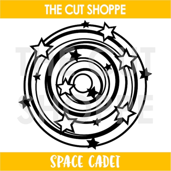
I used very fun "Space cadet" cut file. It looks like a more boyish project but it also reminds me of a circus theme. That's why I decided to use it. 


I backed the stars with patter papers. I also added a little pieces of vellum between the circles. It all makes the cut file stand out from the graphic, black and white background.


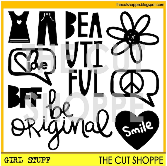
I didn't want to cover too much of my cut out so I just added some smaller embellishments here and there. I also added a title "be original" cut from the other cut file called "Girl stuff".

Those are the files I used to make this page:


That's all for today. Thank you for stopping by and see you in March.

XO Ania