Pages

Thursday, May 31, 2018

New Cut Files | Favorite Moment

New Cut Files are in the shop today, and it's time for me to share another layout with you!  This one even has...wait for it...a PROCESS VIDEO to go along with it!  YAY!  I used the new Untamed Heart cut file.  This is a fun design and one that you will find around the scrappy world, but I definitely wanted to have my own design for the shop.  You can do so many things with this cut file.  Here's a look at how I used it.


https://www.etsy.com/listing/604023372/the-untamed-heart-cut-file-can-be-used?ref=shop_home_active_1

I chose a geometric patterned paper from the Crate Paper Wild Heart collection.  I love the look of the two different geometric patterns combined.  I used the 6x8 paper pad for the positive triangle shapes from the cut file.  I usually tend to use 6x6 or 6x8 papers with cut files, because I like the way the smaller patterns look with the design.


Before adding my photo and embellishments, I machine stitched around the heart and the inside lines.  The stitching adds a fun quilted look to the cut file.  I placed a few ephemera pieces behind my photo to help it stand out from the background, and then layered a few stickers from the collection on the photo.


Once I had everything finished around the photo, I used a few other embellishments to create a visual triangle on the layout.  I decided not to add too many other embellishments, because I really liked the look of all of the patterns and colors in the Untamed Heart cut file.

If you would like to see how everything came together on this layout, make sure you check out my Process Video.  I would love for you to visit my YouTube channel and become a new subscriber, if you haven't done so already!  :) 


You can also find a few other NEW Cut Files in The Cut Shoppe Etsy store today!  Visit the shop to pick them up!

https://www.etsy.com/shop/TheCutShoppe

https://www.instagram.com/ashleyhorton75/

Wednesday, May 30, 2018

Splash | Kelly Janes

Hey there friends! Kelly here with you today to share a new summer themed layout using the Make a Splash Cut File!


I cut the title, Splash, on a sheet of white cardstock that I had colored using a couple different Shimmerz Sprays & Distress Oxide Inks. I then adhered the title to another piece of white cardstock that I had painted light blue using a brayer. I also hand stitched around the title for a little more visual interest and texture. 


I had originally planned to use the painted cardstock as my background, but I just couldn't get the design to flow. So I decided to switch up the design, and cut a large sun from the Make a Splash Cut File on a piece of yellow/orange patterned paper. I adhered the sun to another sheet of white cardstock, tore the painted cardstock with the word Splash, and adhered that painted cardstock on top of the sun.


I then embellished the layout with a few summer themed stickers and die cuts from Amy Tangerine and called the layout complete!

Now you can take a look at my process video to see how this layout came together.


Thanks so much for spending part of your day with me, and don't forget to head to The Cut Shoppe Etsy Store to check out all of the cut files!


Tuesday, May 29, 2018

XOXO 12x12 Layout by Neftali

Happy Tuesday everyone! It is Neftali back again with more inspiration for you all, and I hope you enjoy what I have to share today.

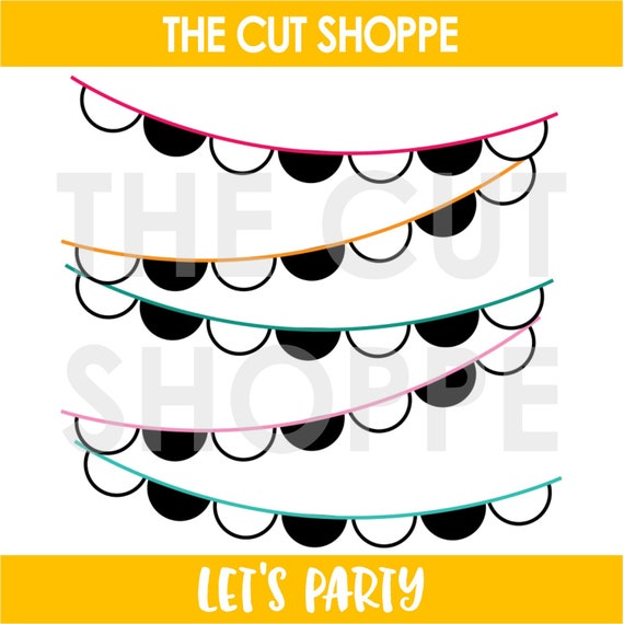
So, a lot of us have been loving the banner cutfile, Let’s Party, because who doesn’t love a good banner? It’s so beautiful.


So, using this cutfile, I decided to back it using The Fancy Pants Designs “The Bright Side” collection. Here is my take using these fun products:


I decided to keep it simple with my white background and the cutfile also on white card stock because I wanted all of the colors to pop off my page, and I think that they sure do!

I mainly decorated to add to that pennant feel by hanging the floral pieces and umbrella bits.

But alas, here are some fun closeups for you to enjoy:


I used a precious photo of me and my son snuggling and I called this layout finished. I hope that I have inspired in a different way to use the Let’s Party cutfile. I will be back next month with much more inspiration!


Monday, May 28, 2018

Made For Each Other by Jill

Hello Cut Shoppe friends!  Jill here with a new layout using the adorable Made For Each Other cut file from The Cut Shoppe Etsy store!

I started my layout by cutting the Made for Each Other file from black floral paper.  Once I laid out the cut file on my background paper, I felt like I needed to do something to really make this cut file pop, so I decided to hand stitch around all the cuts using a pale pink floss.


One of the things I adore about this file is the funky fonts!  I think hand stitching just emphasized it even more.


Once the stitching was completed I added my 4x4 photo matted on white tissue paper with black polka dots.  I added a couple puffy sticker butterflies and flowers around the cut file and added a large floral die cut and more stickers around the photo.  


 This photo is so special to me, as we have wanted a puppy for a while and our Chuca showed up at just the right time.


Happy creating!


Saturday, May 26, 2018

BLOOM | Donna Espiritu

Hello! Donna here with my take on one of the latest cut files in the shop called "Let's Party".


This is the cut file I used


I kind of deconstructed it to complement the pattern on the papers I chose as background.

I used a white cardstock as the base and then backed the empty spaces with pretty papers from the Bloom collection by Simple Stories.

I took advantage of the slope the banner created and adhered the chipboard word art "Bloom" as the layout title. A mixture of stickers, ephemera, and chipboard stickers embellished the page.


That's all from me today! Thanks for dropping by and
Happy crafting,


Friday, May 25, 2018

Espresso Yourself ~ Cards In 2 Ways | Helen Gullett

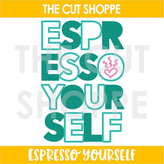
Hello everyone... Helen is here and today I have 2 cards that I created using the Espresso Yourself Cutting File, one of the new cutting files from The Cut Shoppe that just released last week.


On these cards, I am using both positive and negative cuts. This way, you can use to make 2 cards with just 1 cutting file. 

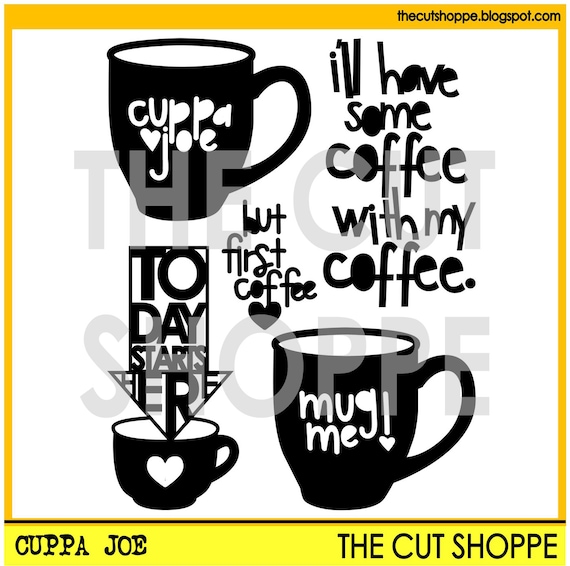
On my cut out, I modified the Espresso Yourself cutting file a little bit. Instead of the steamy heart image, I replaced it with one of the mugs from the Cuppa Joe cutting file


On this first card, I added the words on dark brown/white polkadots paper with dries-clear adhesive glue. After that I fussy cut the extra paper off the words.

I added some shadow on the words using Vintage Photo Distress Ink and foam applicator. After that I added on the card with 3D foam tape for extra dimension to them. I love how those words turned out, they look like chipboard words. On the background, I added a softer look patterned paper. 


On this second card, I added the cut out panel on a light brown/white polkadots patterned paper with dries clear adhesive glue and then I added the whole panel on a white card. 

Using digital cutting files, it quick and easy way to create handmade cards.


If you are coffee/tea/cocoa lovers, you are invited to join this fun Coffee Lovers Blog Hop and Link Up Party this week. You can link up any of your Coffee/Tea/Cocoa Spring and Summer theme projects until June 1. There are many prizes to win! Check out more details at Coffee Loving Cardmaking Blog.

Thank you so much for stopping by today. Hope you all have a fabulous caffeinated day!


Thursday, May 24, 2018

dance | orange gearle

Hi friends! Orange Gearle here with a layout using one of the new cut files in the shop I used white card stock for the cut and then a bunch of beautiful papers from Maggie Holmes Flourish collection. 


The cut file is called Let's Party! And I loved using it to tell the story of my mom and daughter dancing together in a restaurant. 


I backed the file with a bunch of papers from the 6x6 pad in the collection. I love how the 6x6 works for backing cut files because the patterns are scaled down. Here are a few close ups!


I added some fussy cut flowers to my layers and called it done! I also made a process video, if that suits your fancy!


Thanks for stopping by! See you again soon! XO o.g.


Wednesday, May 23, 2018

Oh Snap | Tarrah McLean

Hi everyone!

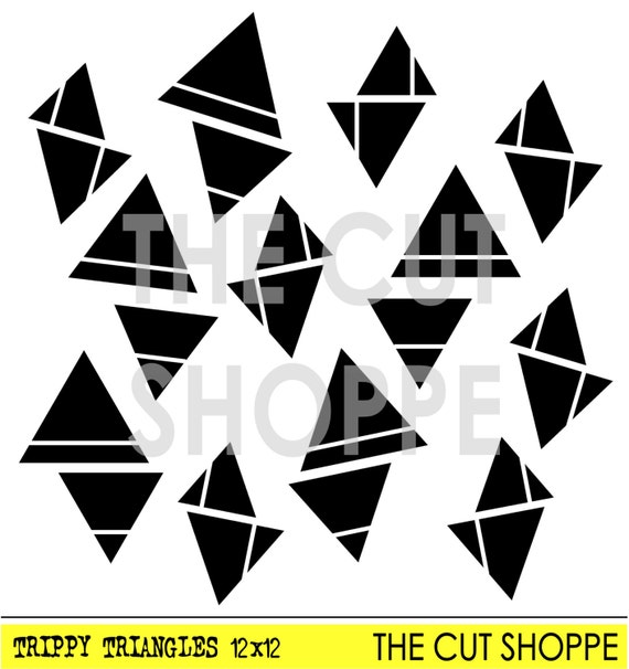
It's Tarrah McLean back with you and today I am sharing a new layout with you using the awesome Trippy Triangles 12 x 12 cut file

Here is the Trippy Triangles cut file from the Etsy store I used on my layout!

I backed all the cut out triangles from the background paper with some of the other papers by Pinkfresh Studio, I used a range of collections in this layout! I love Pinkfresh Studio products! 

My photo was the inspiration for this layout, the shark head reminded me of triangles and the Trippy Triangles was the perfect solution for the cut file to use! 

As I was rummaging through all my Pinkfresh stuff, I came across the transparent words and the one that says 'Oh Snap' was just perfect and made for this layout!

Embellishments were kept to a minimum so as to not cover up too much of the background detail. 

Thanks so much for stopping by today! Check out The Cut Shoppe Etsy store for amazing designs to use in your papercrafting!