Monday, February 29, 2016

Birthday Volcano

Hey there!  It's Katrina from Paper, Scissors and Glue sharing a layout with the "Party On" set. This is a jammed packed set that you can create an entire layout with.


I knew I wanted a big hat.  When I was planning this in my head, I was thinking that the hat was a little different, but as soon as I saw it I knew what I wanted to do.  I trimmed the bottom of the hat with some ribbon and then I found that big flower in my stash.  Perfect for the top of a party hat, don't you think? Some of the areas I backed have foam adhesive and some of them don't.  Plus I used the left over stars from the cut!


The banner cut file in the set was just the right addition to the area above my pictures that seemed a little plain.  I created an offset of the original peach colored banner that I had cut, to place behind.  I like how it turned out.


That's all from me today, be sure to stop by the Shop to see what cut files will work for you projects!


Sunday, February 28, 2016

Hooray with Michelle

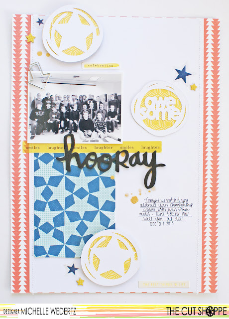
Hello! Michelle here with you today to share with you my latest layout using some of the new cut files from The Cut Shoppe!

Scrapbooking my teenager can be a little tricky sometimes--he's definitely no longer in the cute little boy stage and I struggle a little when it comes to finding both products and designs that are more reflective of his present age. When the Boys Rule cut file was released, I was so happy to have some super cool designs to use for layouts about my son. The set is definitely versatile and I love that the motifs aren't too age specific.


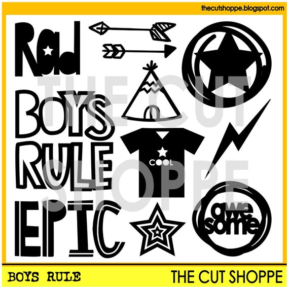
The Boys Rule cut file set includes 11 boy themed icons, that can be used on your scrapbooking and papercrafting projects.

Here is what I did:


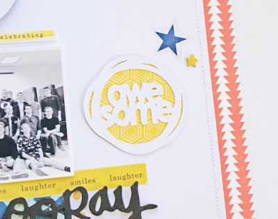
One technique that I haven't really done too much with is backing my cut files with patterned paper and that was something I wanted to try with this layout. I used three circles and placed them around the layout in a classic triangle configuration-one by the photo, one by the title, and one by the journaling. The fun cut files move the eye around to all the important elements on my page.


Thanks for stopping by today and I am really looking forward to seeing what you do with the Boys Rule cut file!

The Cut Shoppe


Saturday, February 27, 2016

Beautiful

Hi there, Irit here with a layout using some fantastic new cut files from The Cut Shoppe store! Here's my finished project-


I used two cut files sets for this layout, the first is called The Tic Tac XO-


The second set is a very versatile one, definitely a favorite, so many possibilities! It's called Girl Stuff. I used the word beautiful and that cute sketchy flower.


I cut my photos to fit into the circles and the heart in the Tic Tac XO pattern, I love how it turned out!


The papers I used are from Pink Paislee, those and all the embellishments are from the February Hip Kit Club kits.


There's also a process video!


 Thanks for visiting and check out The Cut Shoppe for these and lots more fun cut files!  

Friday, February 26, 2016

Beautiful

Hello everyone, Julie back with you today sharing a layout using the Girl Stuff cut file. This file has loads of great stuff on it but I decided to go with the word ‘beautiful’.


I used a piece of white cardstock & cut out the word down the left hand side & backed it with different patterned papers. I then inked through a doily stencil, in yellow & placed my paper layers & photo on top of that, adding a few bits of ephemera around the edges & a cute pink tassel. I backed the page with some patterned paper & sewed around the edge.


I hoped you have enjoyed my page today & I’ll be back with you next month xoxo


Thursday, February 25, 2016

Awesome-Boys Rule


Hello friends!  Candace here with you today to share a layout made with the new to the shop Boys Rule Cut file!  I love this cut file!  As a mom of four boys I just can't get enough of all things awesome, rad and epic and this is all three!! 


For this layout I cut the star circle and awesome circle out of white card stock in various sizes to scatter around the page.  I used the Boys Rule collection from Crate Paper to back the cut file and to embellish the page.  When this collection came out I bought three of everything so I would never run out, and I haven't even made a good dent in it yet!  Here is a look at the final page.


And a few close ups...


Super fun, right?!  I love how these cut files just bring the whole page together.  Thanks so much for stopping by!  Remember to link up your creations so we can swoon over them and so you can get a chance to win a gift card to the shop!  Have a beautiful day!
Candace

Wednesday, February 24, 2016

Boys Rule


Hello!  Jennifer here to share a layout I created using the new Boys Rule cut file!  I alway appreciate masculine themed embellishments and Boys Rule doesn't disappoint with its fun shapes and cute titles!  


I used the "Boys Rule" title with white cardstock as the outline. I filled inside the letters with a white/orange chevron print from Shimelle's new line, Starshine.   I also cut the circle/star files in different patterns and layered under my title and photo!

I also used the nested stars and cut in various sizes and patterns to use.  


Thank you for stopping by!  Check out this fun cut file and lots more in the Etsy shop!  And don't forget to link up your own creation for the Cut It Out Challenge!  


Tuesday, February 23, 2016

Your Feet Should Be Dirty

Hey, friends!  Missy back with you, and today I'm sharing a fun layout made only with the awesome Write On Alpha Cut File.  I love these letters, and they look amazing all put together to form a quote.


I'm a huge Paige Evans fan, and I've seen her create layouts like this where lots of letters are hand cut to form words or a quote.  I decided to let my Cameo do the cutting, and I found this awesome quote on Pinterest.  It did take a while to choose my papers and get everything cut, but once it was done, the layout pretty much put itself together.

I used a light teal cardstock as my base, and I went over the majority of it with white gesso first.  Once that was dry, I used some of my Shimmerz and Heidi Swapp spray inks to create a watercolor effect.  Then I simply arranged all those letters, glued them down and stitched through them.  I only had one spot for my photo to go, so it was easy to put it together.


Swoon at these colors!  So yummy!  I used a variety of Crate Paper and American Crafts papers for this.  The little heart stickers are from Simple Stories.


I used a Crate Paper chipboard arrow here and a clear one from an Amy Tan sticker sheet.  I didn't want to add to many embellishments since the quote is busy in itself.


I did add a bit of bright pink tangled thread and some cork & wood veneer hearts around the photo and my journaling fit right under it.


One last photo just because of the gorgeous colors and patterns!  I highly recommend this alpha set, especially for a fun and unique page like this.


Here's my process video for this layout.  I hope you enjoy it!


Thanks for stopping by, and have a great day!

Monday, February 22, 2016

Our Story


Aimee here sharing a layout using the Tic Tac XO cut file.


I absolutely love using grids, so it was a no brainer to use this file; the grid is already in place!


I first cut the file from black cardstock. I then used some scraps to cut the x’s, o’s and heart.


I just placed the file I had already cut on my mat and then placed the scraps underneath to find the right spot for them to be cut {I removed my original cut before sending the mat through the Silhouette Cameo}


I trimmed down my foundation just a bit and adhered it to black cardstock. I then adhered the black cut to the foundation, and then the x’s and o’s to the black cut.

I then machine stitched over the whole cut.


I printed 3x3 photos of my little guy and I. And added wordstickers from Pretty Little Studio to the heart.


How would you use the Tic Tac XO cut file


Sunday, February 21, 2016

Doctor Who

Hello there! Today I have a layout to share using the Tall Type alpha, and Geeked Out, which is probably my all time favorite cut file!! I am a HUGE Doctor Who fan, and I've had fun using this cut file in the past.


The TARDIS blue (that block of squares for those who aren't Doctor Who Fans) was a hard color to match, so I decided to create my own background. I added lots of stars because quite a bit of Doctor Who takes place in space. For my title, I used the Tall type alphas, and backed them with various blues. The cut files complimented this picture of my husband and I wearing our anniversary gift to each other--Doctor Who shirts!


That wraps it up for today, thank you for joining me!