Tuesday, February 28, 2017

You Are What Dreams Are Made Of

Hello everyone. It's Enza and today I have a new layout to share with you. I used one of the cut files included in the Crop Circles set. I love the new Maggie Holmes' Chasing Dreams collection and was looking for a cut file that matched that feminine, romantic look.


I started by cutting out the doily. As I wanted to add some hand stitching, I decided to offset the image, which gave me an additional border, then deleted the original cut file. The perforate option allowed me to obtain a stitching pattern that I could easily follow. This is something I do often, as it saves me time. I also love the final result.


Once the stitching was all done, I glued the cut file on top of it and started decorating my page. I added several layers of different patterned papers behind my photo and used foam tape to stick it down. The gorgeous flowers were the perfect addition, as they gave the layout that soft touch I was looking for. Here are some more close ups.


I hope you felt inspired today. You can find the Crop Circles cut file set in The Cut Shoppe Etsy store.There are so many more to choose from, you are sure to find the perfect one to fit a favorite collection, picture or idea.

Thank you for stopping by. Have a lovely day!


Monday, February 27, 2017

Cool Dude

Welcome Cut Shoppe friends!  Wendy here today to share a little manly inspiration with the cut files, Out of Line Alpha and Starburst.


With only 2 smaller pictures I knew I wanted to spice up my background and make my little boy shine, the Starburst cut file did exactly that!


To create my title I loved the chunky, boyish feel that the Out of Line Alphas have...


And of course I love creating embellishment clusters to house my titles in and further the theme of my page!


Thanks for joining me today, I hope you are inspired to create for the men in your life!  Don't forget to check out The Cut Shoppe etsy for more inspiring cut files.


Sunday, February 26, 2017

Hello

Hi everyone!

Mandy here with you today to share a layout that I created using one of the new release cut files from The Cut Shoppe etsy store!


I scrapped a beautiful photo that I took recently of my parents with my three kids. I love documenting the relationship between my kids and their extended family!

I used the lovely Shimelle 'Little by Little' collection for this layout! I love all the pretty colours and patterns throughout the collection!

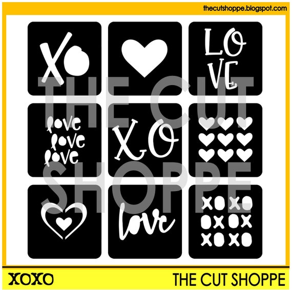
This is the XOXO cut file that I used to create this page...

The XOXO cut file can be used as individual desings or a full background for your scrapbooking and papercrafting projects.

I used the image with the nine hearts and enlarged it to use as the background for my layout. I love how it turned out!


I backed each heart with patterned paper from the 'Little by Little' collection. I added foam dots in between the white cardstock and the patterned papers to give the page some extra depth and interest.


I used stickers and ephemera from the collection to embellish a couple of the hearts.


Here you can see how dimensional the page is!


I created an embellishment cluster to the right of the photo using more stickers and ephemera, as well as a cute little wooden button. I love all these pretty colours!


I used one of the die-cuts from the collection as the title for my layout. And I of course had to add foam tape underneath it, to give it some extra dimension! I seriously could not live without my foam tape! I finished the page off with a few lines of journaling.

Thanks so much for joining me on the blog today!


Saturday, February 25, 2017

Make a Wish!

Hi crafty friends! Kelly here to share a new layout using The Party On Cut File.


In Cricut Design Space I resized the "Make A Wish" sentiment from The Party On Cut File to approximately 13.5". Now if you are familiar with DS, then you know the largest image you can cut on a 12x12 cutting mat is 11.5". But I wanted my sentiment to fill the entire background and 11.5" just wasn't large enough. I continued to the cutting mat with my large 13.5" sentiment and repositioned the cut file by rotating it on the cut screen. I made sure that the cut file was placed within the 12" on the cutting mat and then sent the image to the machine. This worked perfectly! I was able to use my 12" cutting mat but cut the image at 13.5".


I cut the sentiment on both white and black cardstock. I then used the white cardstock to create a shadow effect behind the black cardstock. Next I backed the cut file with a pattern paper from the Bella Blvd-Alex Collection and added hand stitching around all of the letters. I then added 2 photos to my layout from my son's birthday along with embellishments & ephemera from Crate Paper-Cool Kid Collection and the Bella Blvd-Alex Collection.


I love enlarging cut files on my layouts. It always helps the design come together quickly because it helps fill the page.


I recorded a process video that shows how this layout came together. It also includes a Cricut Design Space tutorial showing you exactly how I cut this image in DS.


Thanks for joining me today and remember to head to The Cut Shoppe Etsy Store to check out all of the cut files!


Friday, February 24, 2017

Friday Fan Feature!


It's time for a new Friday Fan Feature!  We've spotted some amazing work this week.  Here's a look at what our talented fans created!

6happy1s

    
andreajk5


dilsah_balci


mirandawebber82


kaybeetoo


Thanks so much ladies for sharing and tagging us!  If you would like to be featured, make sure you share your projects, using cut files from The Cut Shoppe on social media, and tag us @thecutshoppe and/or use the hashtag #thecutshoppe.

Be sure to check back next Friday for another new feature!

https://ashleyhortondesigns.blogspot.com/
 

My new favorite jammies

Hi there,

Zsoka here with you today, sharing my latest layout.

I've been doing a lot of girly pages lately and was kind of missing doing boy pages. So I grabbed my stash of Crate Paper Cool Kid and used that for today's layout. I love this collection so much!

I chose the Out of Line Alpha cut file to create a big title, which is also my main design element.


I cut the letters from yellow patterned paper so that they pop from the grey background. I backed these with different patterned papers from the collection. 


I used a photo of my son from when he was little.  I printed it twice, in different colors. Mainly because I couldn't decide which one I liked more. :) I layered some tissue paper and some patterned paper scraps behind my photos.


As an exception I didn't use a lot of embellishments. I tucked two tags from the ephemera pack under my photos and I wrote my journaling on these.


I added some strips of papers to the bottom and top and I also fussy cut some of the triangle paper and tucked it under my paper strips. I attached a chipboard piece at the top with my Tiny Attacher.


I love to use phrase stickers and there is a sheet with silver stickers in this collection. I chose a couple and placed them here and there on my page. And that was pretty much it!


I hope you enjoyed today's layout. 
Thank you for stopping by, see you soon!


Thursday, February 23, 2017

A wreath layout with the Flower Delivery cut file

Hello, It's Eunyoung. Today I'll show you a wreath layout. I used the Flower Delivery cut file.


I cut the several images from the Flower Delivery cut file with a white cardstock. At first, I tried painting the cutting images with watercolors. But I think the cutting image(shape) is so beautiful itself, so I decided to use it without any painting.

 I chose a pastel colored patterned paper as a background. After arranging the cutting images for making a wreath, I added them using pop-dots. I did machine stitching on the wreath with a white thread.


I added a title and finished to embellish with puffy stickers.


I hope you like my page and thank you for stopping by.