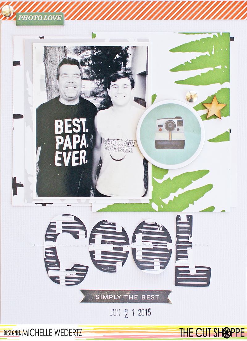
Hi guys! Michelle here with you today and I want to share a layout that features a photo of my teenage son and his grandpa. I don't know about other moms of teenagers, but I struggle a little bit when it comes to putting together a layout that accurately reflects the point in life that my son is at. Simply put, I cannot do cheesy or overly sentimental. I have to keep it cool! Ha!
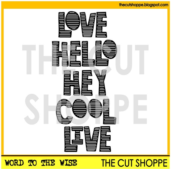
Keeping it cool is exactly what I did with this layout by using the Word to the Wise cut file from The Cut Shoppe.

Keeping it cool is exactly what I did with this layout by using the Word to the Wise cut file from The Cut Shoppe.

This particular cut file worked perfectly for this simple, masculine layout and actually reflects the one word responses I get from the kiddo on a routine basis!

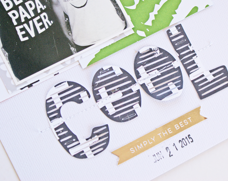
When adhering the title I only used a little bit of adhesive knowing that I was going to run the letters through the sewing machine later. I also like the little bit of dimension that is added to the page when elements are lifting off of the background.


No comments:
Post a Comment