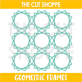
Hi friends! It’s Jodie King with you today and I’m super excited to be The Cut Shoppe’s guest designer for October! I’m from the east coast of Australia and have been scrapping for about ten years now. My favourite projects to create are travellers notebook layouts, mini albums and project life spreads, and I love using cut files in all of them. I had a hard time choosing from all of the beautiful designs in The Cut Shoppe store, but I have loved the Geometric Frames since forever so I decided to adapt them to suit a Traveler's Notebook background.
Firstly I resized the cut file to be 6 inches high. I have the basic edition of Silhouette Studio so I usually use the png file and trace it to create my cut lines. I knew I only wanted two columns out of the three so I traced just a little past the edge of the second column. I sent that to cut on white cardstock, and trimmed the little excess pieces from where the third column started with my scissors.
I’ve used a photo of me with a beautiful horse I met on our daughter’s partner’s family farm recently, and the colours worked so well with the Again & Again collection from Pink Paislee. I used the 6x8 paper pad and trimmed different patterns and colours to back each of the geometric shapes.
Although I love the subtle look of white cut files on a white background, because I was using strong colours on the opposite page of this spread I decided to add a narrow border in a rose pink paper around the white cut file. To do this I firstly played a little with the eraser tool and line tool to finesse the unfinished edge where the third column had originally been, then I ungrouped the shape and deleted most of the intricate cuts inside each geometric shape. Then I used the offset tool to add my border and moved the original file off to the side before sending it to my Silhouette to cut. It sounds like a bit of fussing but these steps didn’t take too long at all, and I’m super happy with the definition that extra pink layer gives my spread.
I added embellishments in a tone on tone effect to each of the geometric shapes except the top right one. I added a darker brown moth to that one instead so that it completes a visual triangle around my spread in that colour.
Thanks so much for stopping by today, and I hope I’ve given you some inspiration to adapt cut files to suit the project you’re working on, and to try out the offset tool in your Silhouette Studio!
We loved having you with us for October, Jodie! Make sure you are following Jodie on Social Media to keep up with all of her beautiful designs. You can find her HERE on Instagram.


No comments:
Post a Comment