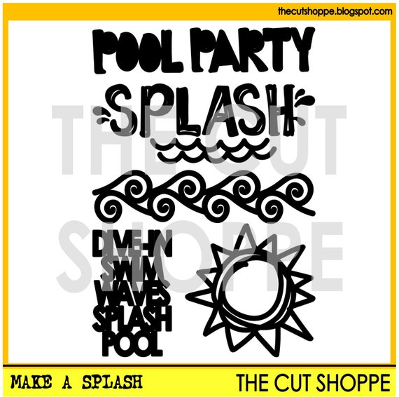
As much as I love cutting out shapes to use on my projects, it's the cool phrases and titles that really get me excited. I sometimes feel totally uncreative when it comes to picking a title for a project and to be able to browse through the selection of cool and unique cut files at The Cut Shoppe means I am able to add some fun variety to my titles.
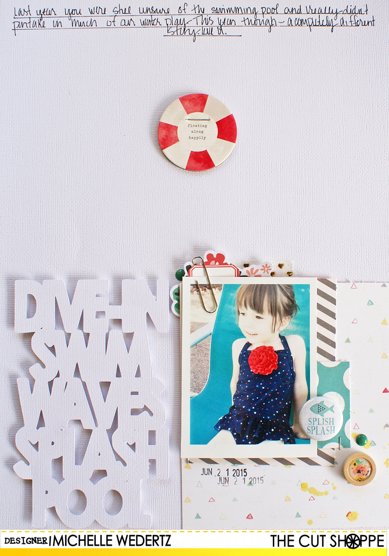
For this next layout, I cut out the stacked "Dive-In" title after sizing it to fill approximately half the width of my page. Since it is on the narrow side, I also increased the width to bulk it up a bit. Here's what I came up with:
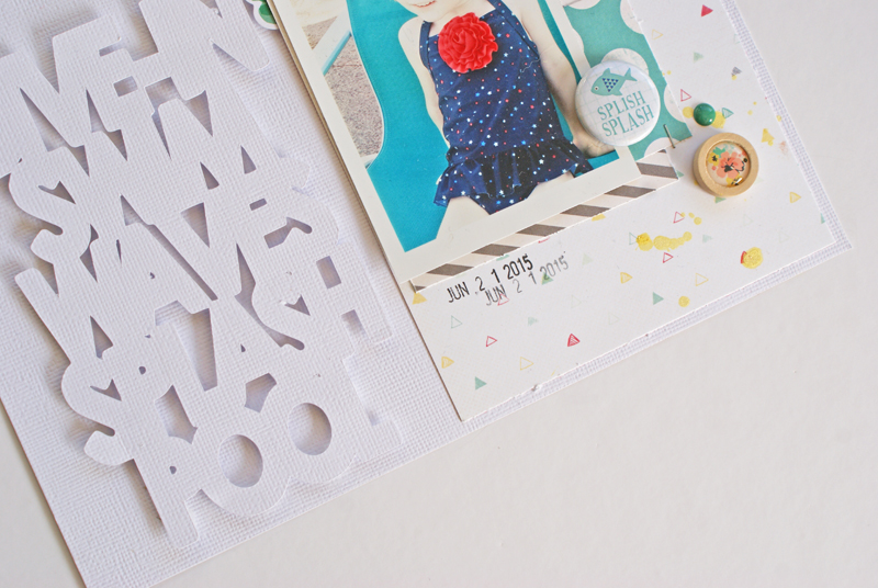
When I began to work on this layout, I knew I wanted to go with minimal color-something that normally isn't my style-and this led to me making the decision to cut the "Dive-In" out of white cardstock, the same as my base. To make sure the title stood out and was easy to read, I used pop dots to raise it up off of the background.
Now it's your turn! I would LOVE to see how you all are using these fun, summery files! To share, you can link your projects up to our current monthly Cut It Out challenge or you can share on Instagram (make sure to tag us!). Looking forward to being inspired by all of you!


No comments:
Post a Comment