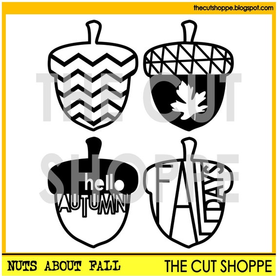
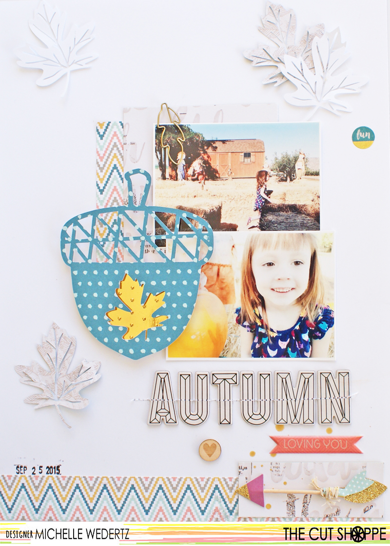
I knew that I really wanted to feature one of the acorns in a big way, so I increased the size of two acorns and cut them out of a bold, blue paper. At this point I wasn't quite sure if I wanted to use one as my title or not, so I gave myself two options to play around with. Here's a look at my final layout:
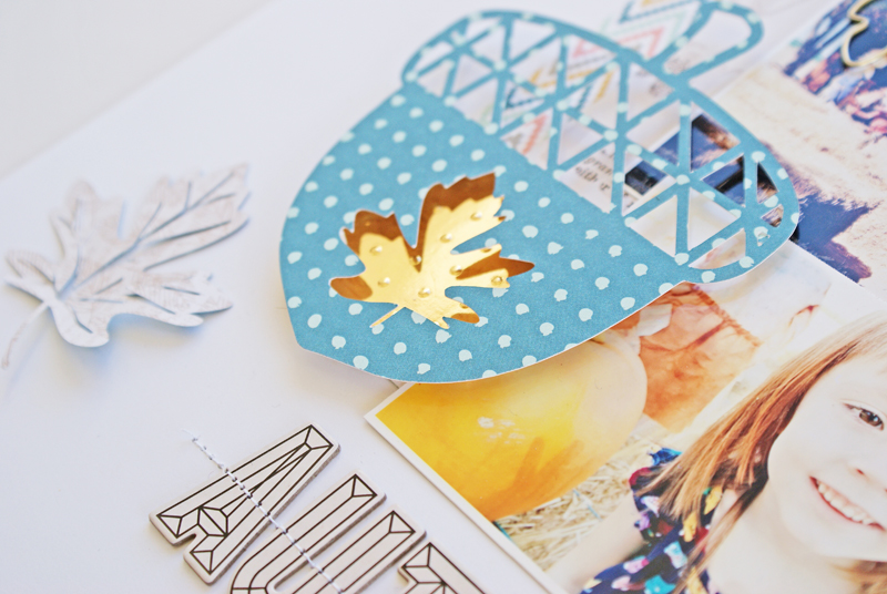
I went ahead and chose the acorn with the leaf cut out of it, backed it with pop dots, and adhered a shiny gold paper underneath. By placing the acorn right there with my photos, the attention is immediately drawn to them.
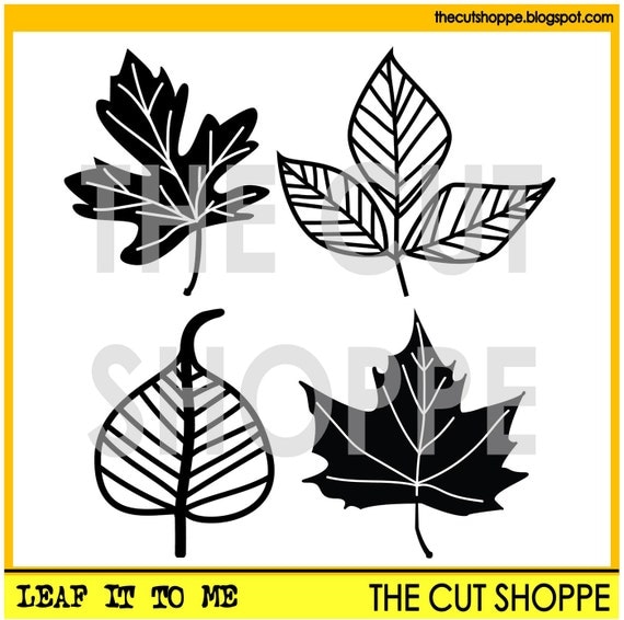
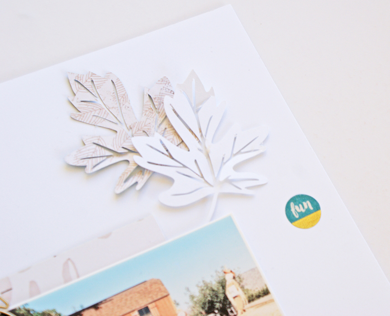
Since I was featuring the acorn, I didn't want my leaves to compete with it. With this thought in my mind, I cut some small leaves out of both white cardstock and a lightly colored patterned paper. This way I could include all of the elements I wanted without overwhelming the page. When placing items such as falling leaves or snowflakes, I will generally follow the triangle rule and place them in three different spots.
Thanks for stopping by today!


No comments:
Post a Comment