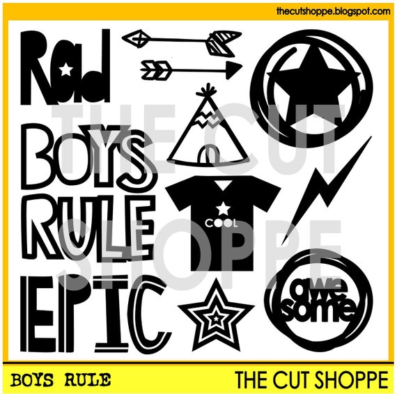
Scrapbooking my teenager can be a little tricky sometimes--he's definitely no longer in the cute little boy stage and I struggle a little when it comes to finding both products and designs that are more reflective of his present age. When the Boys Rule cut file was released, I was so happy to have some super cool designs to use for layouts about my son. The set is definitely versatile and I love that the motifs aren't too age specific.

Here is what I did:
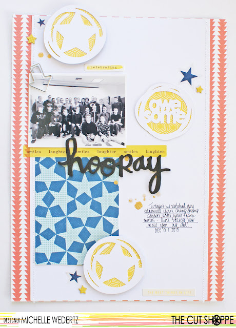
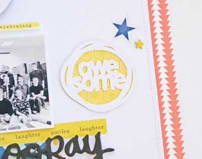
One technique that I haven't really done too much with is backing my cut files with patterned paper and that was something I wanted to try with this layout. I used three circles and placed them around the layout in a classic triangle configuration-one by the photo, one by the title, and one by the journaling. The fun cut files move the eye around to all the important elements on my page.
Thanks for stopping by today and I am really looking forward to seeing what you do with the Boys Rule cut file!


No comments:
Post a Comment