Here is my layout. I used the phrase "Pool Side" from the cut file, enlarged it, and made it my title. I had a different design in mind originally, but I love how this turned out. I backed the cut file with one of the patterned papers and then fussy cut it out. I used three more patterned papers behind my photos and lots of the ephemera and die cuts to embellish. I added some pink and coral ink sprays to some modeling paste and used my palette knife to spread it onto my background.
I first wanted to create a diagonal design with my title and photos, but it just didn't look right to me. So that's why I fussy cut the title out and set everything straight. I did some machine stitching here and added a cute wood veneer.
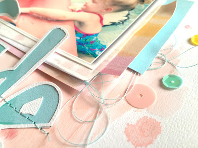
I'm so loving the colors in the collection. They match my pool brick so perfectly...haha! I love this pink blush color, and it looks so soft and airy on the background. I also added a few sequins here and there.
Here's the top of the page. Aren't those cut aparts so cute? I stitched through them and added some wood veneer hearts.
Here's one more look at the title area. I punched the yellow piece from patterned paper to create a little sun and added the die cuts over it with some tangled thread.
Here's my process video if you'd like to see how this layout came together. I hope it inspires you!
Thanks so much for watching, and have a great day!


Such an amazing page and I adore your videos!!
ReplyDeleteBeautiful! Love your creative process videos!
ReplyDelete