Another month has passed and that means it's time to announce our August Cut It Out Winner and get our September challenge going! We had some awesome entries during the month of August, and it's always so fun to see what you all are doing with the cut files! Let's find out who is our August Winner:
Hello! It's Jennifer and I'm so excited to have my first post as a member of The Cut Shoppe design team! Since it is back to school time for most kids, I wanted to do a layout using a photo from my son's open house. I used the 8.5 x 11 Get To The Point as my background as well as one of the cute titles from School Rules.
I cut directly into my white cardstock using Get To The Point. I then used different patterns from the collection and adhered to the back of my page. I love how this gives my layout a lot of color without being too overwhelming!
Here is a close up of a group of arrows!
I love the stars in the center of each of the O's!
Thank you for stopping by today! Please check out The Cut Shoppe for these and many more fun cut files! Have a great day!
Supplies used: patterned paper, chipboard frames, die cuts, brads, enamel dots: Simple Stories So Rad; journaling pen and date stamp: American Crafts; stapler: Teresa Collins for Xyron; Die Cut Machine: Cameo Silhouette
Hi everyone. It's Madeline here, new to the design team and thrilled to be sharing for the first time on The Cut Shoppe Blog! The photo I scrapped is one serendipitously captured a couple of summers ago, when my middle son was stationed on the pool deck, working his summer job.
As soon as I saw the Life's A Beach files from The Cut Shoppe, I knew that lifeguard stand would become a favorite of mine. It brings to mind swimming pools packed with kids, broad beaches dotted with sunbathers, and surfers braving the waves.
First I cut the stand from white, weathered wood-look paper, but then added another dimension by piecing a life preserver from red and white cardstock. I used the outline of the Life's A Beach triple cross icon and cut concentric circles, sizing them to match the ring on the stand. I love the impact made by this extra little detail.
Another fun and summery cut file, Make A Splash, provided my page with a whimsical sun:
By adhering only the center of the sun to my page, its "rays" are left to curl up slightly. You can also see my banner in the photo below. Fashioned out of polka dot kraft tape, it is embellished with red crosses from the Life's A Beach cut file.
Fearless here to show you my birthday layout, my birthday was in June but it's never to late to make a memory of it right? I'm 25, don't know when the time has gone!
Happy Saturday everyone! This is Sheri and sadly, I'm posting my last project for the design team. The Cut Shoppe has always been my favorite shop for cut files so I know I will continue using them for a long time.
For my post today, I decided to do two layouts! Yes two! I am showing how you can use one cut file but get two very different results.
Here are the completed layouts:
Both files were created using the newly released Queen of Hearts 12x12 cut file.
For the first layout, I used the cut file as a stencil and applied a pretty thick layer of texture paste over the cut file. I immediately removed the cut file from the page and let it dry. It took a bit of time, so I just left to do things around the house and came back to it later.
Then I was able to apply my watercolor and spray mist splatters over the texture for a great contrast!
This is one of my favorite ways to use cut files! You get a totally different look than from just using the cut file itself! Give it a try!
I then took that same cut file, covered in the texture paste, and used it on my next layout. I really liked how the paste gave the cut file texture instead of it just being a flat look. I didn't even realize that until I started working with it. I love how using it white on white gives it a very lacy feel to the layout.
I also used the Funky Florals cut file for this layout.
You can see one of the flowers is the actual cut file and one has been cut out after using the cut file as a stencil and applying texture paste. Again, two different looks...one cut file.
Here is the process video for two layouts if you'd like to check it out!
I just want to thank Ashley for this incredible opportunity to be a part of an amazing team. It has been an amazing experience and I can't wait to see all the wonderful creativity of the new team!
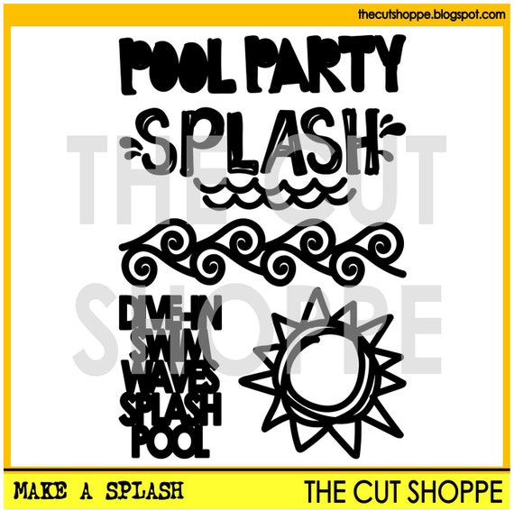
Hello! Michelle here with you today to share a new layout using a fun title from the Make a Splash cut file.
As much as I love cutting out shapes to use on my projects, it's the cool phrases and titles that really get me excited. I sometimes feel totally uncreative when it comes to picking a title for a project and to be able to browse through the selection of cool and unique cut files at The Cut Shoppe means I am able to add some fun variety to my titles.
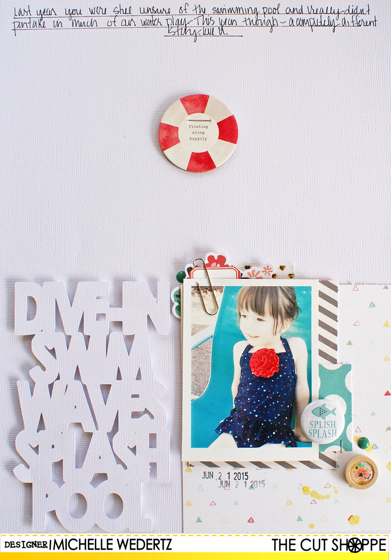
For this next layout, I cut out the stacked "Dive-In" title after sizing it to fill approximately half the width of my page. Since it is on the narrow side, I also increased the width to bulk it up a bit. Here's what I came up with:
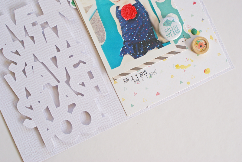
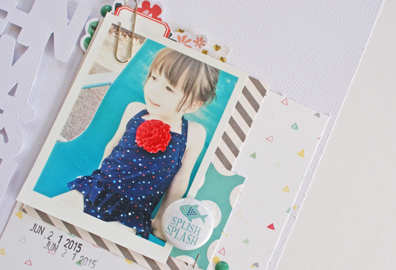
When I began to work on this layout, I knew I wanted to go with minimal color-something that normally isn't my style-and this led to me making the decision to cut the "Dive-In" out of white cardstock, the same as my base. To make sure the title stood out and was easy to read, I used pop dots to raise it up off of the background.
Now it's your turn! I would LOVE to see how you all are using these fun, summery files! To share, you can link your projects up to our current monthly Cut It Out challenge or you can share on Instagram (make sure to tag us!). Looking forward to being inspired by all of you!
It's new cut file day and I've got a fun layout to share with you today! This one took some time and effort, but I really loved the end result. It's always nice when the idea in your head, actually translates to paper! I used the new Say the Word cut file set to create a typography background look for the layout.
I used all of the words in this set, except for the word "Create". All of the patterned papers from the new Finders Keepers collection from Amy Tan came in handy for this layout! Since I used all of the words from the cut file set I didn't want to add in any other text for the title, so I placed the words Shine Today in the center diagonal, to use for the title of the layout. And I didn't want to cover up a lot of the background, so I created a cluster with my photo and a few embellishments from the collection.
I didn't have time this week to create a full process video for the layout, BUT I do have a tutorial to share with you, on how I used the cut file in Silhouette Studio, to prepare the design for my layout! Check it out!
And don't forget to head over to The Cut Shoppe to check out the other new sets that are now available. Here's what you'll find!
Supplies: Say the Word cut file: The Cut Shoppe; Patterned Paper, Bits, Thickers, Rubber Words, Rubber Charms, Stickers, Puffy Stickers & Rub-Ons: American Crafts; Flair Button: A Flair for Buttons; Wood Drop Stickers: Pinkfresh Studio; Enamel Dots: Freckled Fawn & My Mind's Eye; Die Cut Machine: Silhouette Cameo