Sunday, January 31, 2016

XOXO

Hello everyone, Julie back with you today sharing a layout I did with the fab X to the O cut file.


I cut it out on white cardstock, just shy of 12x12 & mounted it onto that awesome blue marble paper by crate paper ‘hello love’ & then again mounted that onto black cardstock & sewed around the cut file. I choose to print off two photos, one in black & white & another in colour & added a photo mat of layers behind that, putting it towards the bottom right. I half embossed my wood veneers in a teal colour & finished the layout off with ephemera & chipboard pieces.


Thanks for stopping by today & I’ll see you next month xoxo


Saturday, January 30, 2016

Happy Birthday-Michelle Wedertz

Hello! Michelle here again to share a layout using two new cut files from The Cut Shoppe! One of my favorite subjects to document are the birthdays of my children and I did just that using both the Snap To It and Party On cut files:

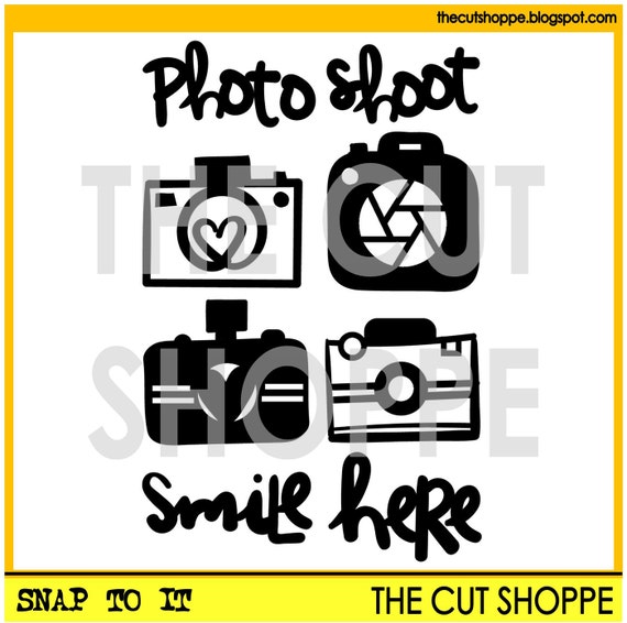
The Snap to It cut file set includes 6 camera themed icons, that can be used for your scrapbooking and papercrafting projects.

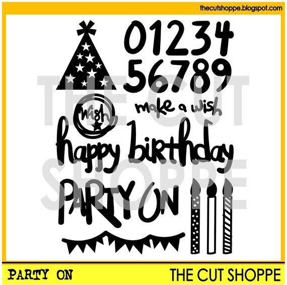
The Party On cut file set, includes 8 birthday themed icons, that can be used for your scrapbooking and papercrafting projects.

My son turned 15 in December (I am not really quite sure how that is even possible???) and I wanted to use both a camera and the "happy birthday" and I chose to cut both out of the same piece of black patterned paper. Here is how my layout turned out:


Most of the time, I either cut my shapes and phrases out of white cardstock or patterned paper. When choosing patterned paper I have to make sure the pattern doesn't distort what I am cutting. I had intially chosen a more "solid" camera and the result was a camera that really didn't look like a camera! My solution, since I was super set on this piece of patterned paper, was to choose a camera that had thinner lines that way I saw less of the pattern and more of the outline of the camera. Here is a closeup of the camera which I adhered with pop dots to make it's outline even more pronounce:


Looking forward to seeing how you use these cut files on your own pages!

The Cut Shoppe

Friday, January 29, 2016

Bob the Betta with Retro Rectangles

Hey there Cut Shoppe fans!  It's Katrina from Paper, Scissors and Glue here today to share a fun new way to use your cut files.  If you have a laminator and a laser printer you are already there!  If not, you are going to want to get them.


 I used the Retro Rectangles file for my background, but as you can see, it's not cut!  That is because I foiled it.  Yep, you read that right, foiled!  Foiling is the new hot trend right now and there are several different ways to do it. I am here to show you how use a laser printer to create a background.


I picked out the file I wanted to use and then a pattern paper that I wanted to be my background.  Because my laser printer only prints letter size, I cut my pattern paper down to 8.5 x 11 so I could run it thru the printer.  Open up a Word on your computer and then insert a picture. You could also use any program that you could do this in. This will be where you insert your cut file onto your document. Size it to however big you want it and adjust where you want it on your page.  Then just print it out with your laser printer. This is what it looks like below.


It has to be a laser printer, not an inkjet.  An inkjet printer will not work, because the foil reacts with the toner from the laser printer when heat is applied aka running thru a laminator. Just lay the foil transfer sheet, color side up, onto your pattern paper. Use a carrier sheet to run it thru the laminator.  I had to make two passes, because my foil sheets were only 6x12 inches. OH and I use parchment paper as a carrier sheet!  


Once you have foiled all the areas, you peel back the foil and the magic happens.  This is the fun part!  If parts don't cover well, you can always run everything back thru the laminator again to cover the parts that were missed.  It doesn't hurt the foil that is already applied.


Here you can see the shine.  This is so fun to do and it's another fun use for your cut files.  I know I am going to be doing it more!


And these are pictures of Bob my betta fish.  I wanted to get a fish for my office at work, but I ended up getting attached to him at home and couldn't take him to work!  He is quite social and is one of the prettiest bettas I have seen!


If you have any questions about foiling cut files, please feel free to contact me and I will help if I can.  I can tell you that I used a Canon w6030 laser printer, a Royal Sovereign laminator that will laminate up to 12 inches and DecoFoil for my foil.  You can pick up the laser printer and laminator at pretty good prices if you watch for sales online.  I got the printer for under 70.00.  

Thanks for stopping by the blog today! And don't forget to head to the shop to pick up some fun cut files to use!


Wednesday, January 27, 2016

Love

Hello! Jennifer here today to share another layout I created using some of the awesome new cut files from The Cut Shoppe!  Since we are getting close to Valentines Day, I couldn't wait to use some of the holiday themed cut files!  


I used this ombre print from Bella Blvd's Valentina collection with the 12x12 X To The O cut file. I adhered it to a white cardstock background followed by adding a darker print to the outside edges.  


Isn't this Kitschy Cursive Alphabet adorable? I thought it was perfect for the title of my page! I added coordinating stickers as well as sequins and wood veneer hearts to accent.  


 Showing more of the background file as well as more embellishments!  

 At the top of my photo, I added coordinating stickers as well as a gold clip from Studio Calico.  
Thank you for looking today! Be sure to stop by The Cut Shoppe for these and many more fun cut files! Have a wonderful day!  


Tuesday, January 26, 2016

Photo Shoot

Hi, Laura with you today. If you hadn't heard, my husband and I got to go on a photo adventure tour in Costa Rica last month. It was so amazing and this was pretty much the scene everywhere we went. There were 10 of us on the tour (my mom and step dad lead them) and we were taken to the most incredible places to shoot really amazing things. In this photo (photo cred goes to Pat Lassarde) we were shooting a quetzal in a nearby tree. The guy looking off in the other direction is a guide and he is looking for more birds. They really are incredible birds.

I recently ordered a pen holder for my Silhouette and thought these whimsical cameras, from the Snap To It set, would make a fun background. I arranged the files on my design page, changed the cut function to sketch, placed my Micron pen in the holder, and sent to my machine. I then got out an assortment of distress inks, smooshed them onto my splat mat, and watercolored the cameras. I cut out one camera, slight larger than the rest, inked it up, and added a penned border so it would match the background cameras. The camera paper was pretty bright, so I through a piece of deli paper on top to mute it. The saying was perfect for my title and I decided to cut it in black and used black spray for my splatters, to add that graphic feel.


This is the bird we were shooting


Head over to the shop and pick up this file for all of your photo needs, it is so versatile!


Monday, January 25, 2016

Social Media?

Happy Monday Cut Shoppe friends! I'm here with a favorite background from The Cut Shoppe Etsy store, the Very Squarey cut file which includes both 12x12 and 8.5x11 sizes:


The title of this page is a bit tongue-in-cheek, and pokes fun at the five cousins in the photo below. It's Christmas day and there they are, sitting side by side, totally engrossed in what is on the devices in front of them. Maybe they are communicating by text?! ;)


I thought that the Very Squarey cut file would be perfect for my background, with the squares representing the many screens (laptops, smart phones, ipads, etc.) that sometimes seem to take the place of face-to-face conversations. Adding snippets of text was an afterthought, but totally appropos.


Although I could have gone my favorite route, all out colorful, when backing the cuts, I thought monochromatic would be a better option. A somewhat busy black and white photo certainly didn't need the competition!

Many of the same papers were repeated in the center for my all-in-one photo/title/journaling mat, which corrals the aforementioned elements, preventing them from getting lost on my page.


The question remains. When having a family gathering, should we put a basket by the door with a sign that says "Deposit all phones HERE!"? What do you think? ;)

Sunday, January 24, 2016

Always Time For a Dance Party

Happy Sunday, friends!  Missy here again, and today I'm sharing a fun layout I created using two of the newer cut files:  Kitschy Cursive and Snap to It.  They are both very versatile and can be used on just about any project.  You can create anything with this alphabet, and cameras are suitable for any and every layout!


I used the Cocoa Vanilla Life is Beautiful collection.  I've had it for a while and just haven't had the chance to use it.  It's really pretty, and it went perfectly with my photos of my daughter in her yellow shirt.  She decided to have herself a little dance party one day and I had to get pictures of it :)

I did a lot of mixed media work on this layout.  I used white gesso first, and then I came in with some of my Shimmerz watercolors and texture pastes.  I wanted to bring in more yellow, and so I added a lot of it to the background.  I used papers and a die cut frame as layers behind the photos and then added the title beneath it.  I created the word "party" using the Kitschy Cursive cut file.  I simply traced each letter and then welded them together.  I also cut that little camera from Snap to It.


I cut them both on white cardstock and then painted them with Shimmerz watercolors.  I also added some gelatos to them to get some variation in shading.  I used some October Afternoon alpha stickers for the first part of my title and then added in some flair.  This particular flair button is part of the collection.


This flair is from A Flair For Buttons, and it matched perfectly.  I added in some machine stitching in a few places.  I really love that little banner piece from the collection...it fit perfectly in that spot.  Plus, it goes with my "party" theme :)


Here's another AFFB flair.  Here you can also see the texture paste...it really does give great texture and it's just really pretty, I think.  I added in a lot of tangled thread in various places.  I think it gives great pops of color and great texture.


Here's one more close-up...lots of fun texture, die cuts and dimension.  This was really fun to put together!


Here's my process video if you'd like to see how this layout came together.  I hope you enjoy it and get some fun ideas!


Thanks for stopping by, and have a great day!


Saturday, January 23, 2016

Photo Shoot

Hi! Irit here with a new layout featuring my new favorite cut file, Snap To It, which has 4 fantastic cameras! I love cameras, (probably as much as I love florals and feathers, and that says a lot!) and they can be used on pretty much every layout, since there's always a photo there! 
Here's my finished page-

 
So I used my Cameo and cut a bunch of cameras in different sizes. I highly recommend doing that, especially with such a versatile cut file. Cut a bunch and keep them handy when creating your layouts!


This cut file was just perfect for all these photos I had. We needed a passport photo of our new baby, and it was not easy to get her to look straight ahead, keep her mouth closed and eyes open... It was really funny and only took like 20 attempts to get it right ;) 
Since my background was very light, I decided to add some black outline to all my die cuts. I just love how it turned out. You can do this with any color, as well as color the die cuts with watercolors or other paint. Super versatile. Here's a closer look-


I kept everything else really simple, and just added a few puffy stickers and some enamel stars, as well as my journaling. I cut down the white cardstock and mounted it on a 12*12 Pinkfresh Studio patterned paper that complimented my simple color scheme.


With my leftovers I created another layout, so nothing wasted!
You can see exactly how I created this layout in the process video-


 Thanks so much for visiting and be sure to check The Cut Shoppe for this and lots more great cut files!