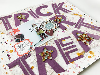
Here are the two layouts I created from this amazing cut file!
I chose a purple card stock I had in my stash for these layouts, because who can resist purple? I began with the actual cut file and sat down to work on the first layout. My photo is our son Addison, from 2015, when he dressed up as Slender Man.
I took color cues from his black and white costume, so I began with this patterned paper from the Pink Paislee Auburn Lane collection and added really rough brush strokes and paint splatters using white acrylic paint. This created my background.
Once my background was fully dry, I backed the cute file with a colorful but still mostly white patterned paper from the Echo Park Bewitched collection. This patterned paper ties in beautifully with the other elements in the layout, and sets the tone for the color palette of the layout.
I also added some die cuts and other puffy stickers, using the stars in the cut file as home bases for the clusters. I had fun with this, using die cuts from several different Halloween collections, including Pebbles Midnight Haunting and Spooky Boo, Pink Paislee Spellcast, and puffy stickers from Pebbles Spooky Boo.
For a bit of journaling I used a 3x4 journal card that has been cut down and tucked underneath the cut file. Notice how all the embellishments lead your eye from the top to the bottom of the layout, following the words of the cut file!
My second layout idea was hatched as I took the negative parts of the cut file off my Silhouette cutting mat. It looked amazing, just having the words, and it also affords a bit of flexibility with the cut file. Here is how it looked once the positive space was taken away, and staged for the layout.
So I printed out a photo of our daughter Emberlynn, who that same year was dressed as Robinette of the Hood. Here is that layout, completed.
The background for this layout is too cool not to share. I added a layer of gesso to my patterned paper from Simple Stories Simply Fall. Then I used cheesecloth along with matte medium and gesso to adhere the cheesecloth to the background. This created a really rough, Halloween-themed texture that I absolutely adore! Once that layer was dry, I splattered Tim Holtz Distress Inks in Wild Honey and Seedless Preserves all around the page. This was so much fun!
Now the second round of fun can begin, with layering the negative space from the cut file and the photo + embellishments. Having the letters from the cut file now separated allowed me to drop them around the page, so I did just that.
I adhered the letters using my hot glue gun so they would stay affixed to the background. I also added my photo, along with some fun embellishments from the Simple Stories Simply Fall collection.
The one challenge I had in using the negative space was that some of the details of the stars were lost, so I decided to fill those stars. I have used some embellishments called Dew Drops that I had in my stash for so long I don't remember who made them. I laid them out into the shape of the star and poured Glossy Accents over them, and allowed them to dry overnight.
That was a fun adventure and I hope you've been inspired to try using the negative space of your cut files too! Thank you for joining me, see you soon!


These are very cool! Thanks for sharing. I've been wanting to use cheesecloth on a background so I was glad to see how you used it. I also love your idea using the Dew Drops and glossy accents. I have a bunch of those drops from like 8+ years ago so thanks for another idea on how to use them up. :)
ReplyDelete