Wednesday, August 31, 2016

Most Favorite

Hello everyone! It's Zinia here and I'm back to share with you another layout I created using a gorgeous cut file from The Cut Shoppe.

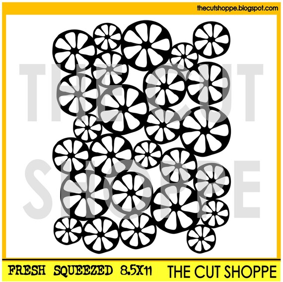
For this layout I used the "Fresh Squeezed" cut file in 8.5x11. If you want to cover most of your page but you don't want to go for a full 12x12 cut file background, it's a really good idea to cut the 8.5x11 version and place it on a diagonal.


So I cut this cut file from white cardstock and I backed it with pattern papers from the Pink Paislee Fancy Free collection. I tried to follow a rainbow order and spread the patterns as evenly as possible.


Once I was done backing my cut file, I placed it on my background and traced around it. Then I grabbed my gelatos and started picking the colors that matched with my papers. I kept the cut file next to my page so I can easily see which color goes in which circle.


First I added a little dot of color in the middle of each circle and then I went back with my paintbrush and spread the colors outside my pencil lines. This way I created an explosion of color behind each of the circles.


I kept my embellishing very simple. I used some of the Fancy Free buttons in the middle of some circles with matching colors. I also added some bits from the puffy stickers, wood veneers and layered stickers.


I really hope you enjoyed and got inspired to create something beautiful with your cut files. Until next time, happy scrapping.




Tuesday, August 30, 2016

Beach Bound

Welcome to the Cut Shoppe blog!  Wendy here today with quite a few cut files combined to make this beach appropriate page.  I began by fussy cutting those big bright flowers from the Jillibean Soup paper, then it was time to make a splash!


The Blank Canvas cut files were the perfect non messy way to add the look of water splashes to my page.  I then used some stamps and mists to further the watery look.


I had cut the anchor out from the Land Ho cut files previously for another layout, but I didn't end up using it.  So I tucked that in the flowers to add a bolder color.


The Summer Sun & Fun cut files were perfect for my title!


One last leftover cut file from a previous project, Go Fly a Kite was a perfect piece to add some more dimension to my page and fly away!

Thanks for joining me today!  I hope you have been inspired to get cutting, so here is a link to the Cut Shoppe etsy so you can find your own cut files!


Monday, August 29, 2016

#BESTIES


Hello everyone!,  Nathalie here bringing a layout that combines some of my favorite things:  cut files, stitching, and black and white pictures (in no particular order...).  


The completed layout


To create the background of this project, I chose the curly cue figure of the "Oodles of Doodles" cut file, and welded together a few of the shapes.  I used the sketch pens to draw the curls, and then added an offset to the entire image.


 After using a push pin to make little holes on the curl designs, i used a few hours of Netflix to stitch away my design.  The colors of the thread are those on the Fancy Free papers from Pink Paislee (which are used on this layout).


a close up to the stitching and pattern on the design.

  To create the title, I chose the Friends Forever cut file.   I used gold glitter paper to cut the word "Besties", "#", and "heart" shapes.


I used the heart shapes as ephemera pieces on the picture, along with some of the paper cut-outs from the Fancy Free collection.

a close up to the picture's details.

Thanks for stopping by, I hope you visit the Cut Shoppe's Etsy store to pick up these cut files and many more (there are so many possibilities in each cut file).   Don't forget to share with us what you are creating with The Cut Shoppe  cut files,  we love to see your projects!


See you all soon!


Sunday, August 28, 2016

DREAM

Hello everyone, it's Monique on the blog today sharing another summer layout featuring the "Rosey Posey" cut file. I adore the warm summer days we're having right now. Not because I love the high temperatures (not at all!), but because of the fun summer photos I can finally take! The Netherlands are famous for their grey skies and that doesn't make great photos. Having said that, I have to admit that this photo was taken in Greece, lol.


I adore the Rosey Posey cut file I used for this page! I cut it from a sheet of white cardstock and added a bit of light pink Gelatos mixed with water. 


For my layout I used the "Shine" collection from Maggie Holmes. I love the colors and all the embellishments in this collection. The "open" flower, leaves & heart die-cuts match this cut file to a tee! 


With some machine stitching and a few color shine drops my page was done!

Thank you so much for stopping by today! I hope I gave you a bit of inspiration to scrap those summer photos! For more awesome cut files, please hop over to The Cut Shoppe Etsy Store

Wishing you a fab Sunday! 


Saturday, August 27, 2016

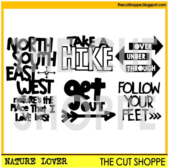
Nature's the Place that I love Best

Hi everyone!

It's Mandy here with you today, and I'm sharing a fun layout using the Nature Lover cut file set available from The Cut Shoppe Etsy store!


I love this photo of my eldest daughter when we were camping a few years ago! She had created herself a bed of leaves to relax on and she had dirt on her face... I think this photo just sums up the fun that we have when we go camping!

I used one of the phrases from the Nature Lover cut file set for my title...

The Nature Lover cut file includes 5 nature themed designs, that can be used on your scrapbooking and papercrafting projects.

I wanted the title to be the main feature of the page (along with the photo of course) so I enlarged it so that it took up the whole left hand side of my layout. Once I had traced the phrase in my Silhouette software, I released the compound path so that I could play around with the words a bit. I resized some of the words so that some were bigger than others and moved them around till I was happy with their position, taking into account where I wanted to place my photo. I then cut the title out of a piece of white cardstock and backed each word with different patterned papers from the Pink Paislee Atlas collection.


I love large titles on layouts! I think they make a real impact and they take the hard work out of the design process! To embellish the page, I added a couple of felt clouds, some wood veneer pieces, and a flair button.


I added my journalling underneath the photo, and then I finished the layout off with some enamel dots and little word stickers.

Thanks for joining me on the blog today! Be sure to pop by The Cut Shoppe store to check out the new cut files that were released this week!

Friday, August 26, 2016

Best Kid Ever

Hello friends!  Candace here today sharing with you a fun boy themed layout using my current favorite cut file the Everyday Essentials cut file set.


If I haven't said it already, I love this cut file!  It really does have the "Everyday Essential"  cut files that you would need for your projects.  The possibilities are endless!  
One of my favorite techniques is to mix open space in cut files with stitching.  The star in the center of this cut file set is perfect for this!  Here is a look at the final layout!


In the close ups you can see how I switched between keeping the file open or stitching around it.  This add more dimension and interest to your layout.


I loved using all the fun embellishments from the Cool Kid collection from Crate Paper!  Such a super fun collection for documenting all the boy moments in life.  
I hope you enjoyed a little mix and match inspiration today!  Give stitching and backing a cut file a try on your next layout and don't forget to tag #thecutshoppe so we can swoon over your creations!

Have a beautiful day!

Candace


Thursday, August 25, 2016

Dream Come True

It's Thursday, and that means new cut file sets are available in The Cut Shoppe Etsy store!  We've got some awesome designs for you this week, and I used two of the new sets on my layout.  And I'm pretty excited about this layout because of the photo!!  It's a photo of my FIRST EVER physical product, created from my own designs!!  So obviously, I had to document the photo right away!

  
The photo on the layout is one I snapped of my Clear Stamp set, that is part of the OAKLEY AVENUE Fall collection with Pretty Little Studio.  When I received the stamp set in the mail, I had to take it out right away and try it out.  And, of course, I had to take a photo to share on my social media!!

When I started this layout, I knew I wanted to use the new Strings Attached cut file set.  I decided to go with the circle design, because I thought it would be perfect for a shaped photo.  I used the no cut feature on the outside circle of the cut file, so I could go back and draw it with the Sketch Pens.  


https://www.etsy.com/listing/460904374/the-strings-attached-cut-file-includes-4?ref=shop_home_active_6

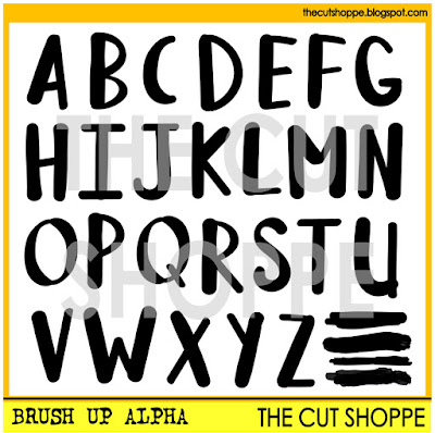
I also used the new Brush Up Alpha for the title of my layout.  I selected the letters for the title, Dream Come True and arranged them around the Strings Attached circle.  Once I had all of the cut files the way I wanted them, I sent it to the Cameo to be cut.  Then I stitched around the circle drawn by the Sketch Pen with 4 different colors of embroidery floss.


https://www.etsy.com/listing/460903294/the-brush-up-alpha-is-a-handwritten?ref=shop_home_active_8
 
I decided to use the Amy Tangerine Oh Happy Life collection for the layout, because it went with the colors in my photo...and because I didn't have the Oakley Avenue collection to work with...yet!!  :)  But I loved that the Oh Happy Life had the Reds, Yellows and Oranges, which are great fall colors.  And the cute owl from the Ephemera pack was a perfect embellishment, since my stamp set goes with a fall collection.  Since I had a large photo and wanted to feature two cut files, I kept the embellishing simple with two embellishment clusters.

Both of these cut file sets are now available for purchase in The Cut Shoppe Etsy store, along with a new Cut & Fold design, Cheeky Chevrons!  And you can still save 25% off of your purchase through the end of this month, with the Discount Code TCSCS25!

https://www.etsy.com/shop/TheCutShoppe

And if you're interested in picking up some (or all!!) of the Oakley Avenue collection, it's now available for Pre-Order on the Pretty Little Studio website.  Here's a peek at some of the items included with the collection!

http://www.plspapershop.com/category-s/2269.htm
 
Thanks for stopping by today, and don't forget to head over to TCS Etsy store and get your favorite designs at 25% off!!

http://www.ashleyhortondesigns.com/
 

Wednesday, August 24, 2016

Love

Hi! Irit here with a 12x12 layout I created using some fun new cut files from The Cut Shoppe! Here's the finished page-


To create this layout I used two cut files-


The Hello Hearts file is great for a statement piece. I cut it from white cardstock and mounted it on some pretty Felicity Jane Happy Day patterned paper.


For my title I used the word Love from the Oodles of Doodles file and backed it also with patterned paper.


Check out the video tutorial I created-


Thanks for stopping by, check out The Cut Shoppe for these cut files and many many more! Have a lovely scrappy day!