Wednesday, May 31, 2017

Brave

Hello again friends! Candace back with you today to share a fun little travelers notebook spread.  I like to do spreads in my travelers notebook when I just want to highlight one picture and a short little story.  Today I wanted to capture my little guy and his love for the outdoors.  For this spread I used the XOXO file.  


I started my spread by backing the file with a light grey star patterned paper.  I wanted my spread to look like a lose grid.


I placed my 3 blocks of design on the left side of the spread and my photo on the right. 


For my title I stamped the word brave on one of my design blocks. 


I added some light embellishments around the spread with chipboard, cork and metal. I like the contrast these three elements bring to the monochromatic design of the spread.


Thanks for stopping by today.  Give working in a lose grid a try on your next travelers notebook spread!  Have a beautiful day!

Candace


Tuesday, May 30, 2017

Oh Ava

Hello its Melissa here and I can't believe May is nearly over!  Its almost Winter her in the Southern Hemisphere, and my youngest is 6 months already!!

For this post I decided to focus on a layout with a big title and small photos.  I used my March Hip Kit, and in order to make this layout come together quickly I used the Paige Evans Oh My Heart paper with all the squares of patterns on it.  I cut the title with the All Caps Alpha.  When I first made it the letters were getting a little lost, so I outlined them with watercolours in corresponding colours. This layout is all about our baby girl and her love for her blanket.


I love the little bear sticker from Shimelle's Little by Little collection standing on the "A"!


I had fun layering the Oh My Heart floral die cuts.


 Here is the All Caps Alpha.


Thanks so much for looking! I'll see you soon in June.


Sunday, May 28, 2017

Ice Cream Is Always A Good Idea

Hi! Irit here and I'm excited to share my latest project for The Cut Shoppe! It's all about one of my favorite things in the world... Ice cream!! Here's the finished layout-


I used two cut files here-


To cut only the outer edge of the open letter alpha I right clicked on them, clicked release compound path and clicked weld. Like I always do, I welded everything I could in the Silhouette software to have as little pieces of paper to deal with as possible! 
I switched Love for Ice cream on the cute saying in the Love Rules Freebie that was send in a newsletter.


I outlined  the letters with a black pen to make them pop off my colorful background.


Thanks for visiting! Stop by the cut shoppe for these cut files and more!

Saturday, May 27, 2017

Mixed Media Wall Art

Hello everyone! It's Zinia here to share with you a page I created using a lovely cut file from The Cut Shoppe store.


My initial idea was to create a mixed media scrapbook layout but the mixed media part got a bit out of control and I loved it so much that I didn't want to add more things. So I decided to use it as a wall art piece and use it to decorate my craft room.


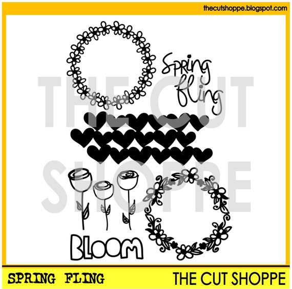
I cut out a wreath from the Spring Fling cut files set and stuck it on a piece of white cardstock using foam adhesive to give it more dimension. Then I started playing around with all sorts of paints to create an abstract background.


I started with my neutral and dark colors and spread them around the page. I also used some texture paste to add a few more details.

Then I brought in my bright colors and added fun splatters, drips and scribbles. I kept adding my mixed media paints following the shape of the wreath to accentuate it.


I really hope you enjoyed this and got inspired to use your cut files in more creative and artistic ways.

Friday, May 26, 2017

Let's Go Play


Hello there!

The weather is getting nicer and warmer by the day!  All I have been thinking about is Summer, vacation, and lots of family time.  With that in mind, I chose the Make a Splash, and Let's Talk Summer cut files to document a picture of my daughter and the little enjoying some pool time last summer.


It all stared with the Make A Splash cut file, which was used to create the waves in the page.  I chose to stitch the image, and then used some watercolor to shade in the waves.


To create the title, the Let's Talk Summer cut file was used to create the "Let's Go" word outlines.  The  cut out was then backed with papers from Echo Park's "Summer Fun"collection.   The same collection was used to add small details around the picture and the entire page.


I  really hope this brings a little bit of inspiration, and you start dreaming of all the summer memories you are about to create, and a way to document them.  Remember there are lots of designs available at the Cut Shoppe store, that can make you memory-keeping easy and unique.

Thanks for stopping by today!!


Wednesday, May 24, 2017

Hello Life

Hello friends! It's Enza here and today I'm bringing you a new layout featuring the Say Anything cut file set.


Finding a title for my layouts is always a struggle. Anything that comes to mind sounds and looks silly, so I end up using the same words over and over again. This awesome cut file set has some sentiments that are perfect if you, like me, are lacking imagination ;)

I enlarged one of the sentiments to fit my 12x12 background paper. The collection I used is the gorgeous Dream On collection by Pink Fresh Studio. I chose one of the patterned papers for the cut file and used other ones to back it. I also created an outline for the cut file as I wanted to add a border to it. To give it more dimension, I used foam dots to adhere the title down.


 Once I had that in place, I started building my layers behind the photo.


To balance off the big title, I cut out two strips of patterned paper in different colors and placed them in the top portion of my page. I also decided to stitch around the edges to add more texture. I repeated the stitching in the bottom left corner of the layout as well. Lots of fun embellishments finished the layout.

Thank you for stopping by today. Don't forget to check out The Cut Shoppe Etsy store for this great cut file set.

Have a lovely day!


Tuesday, May 23, 2017

Love You, Girl

Hello Cut Shoppe friends! Today I'm sharing a project of my daughter using the Happy Clouds cut file from The Cut Shoppe Etsy Store and my ginormous stash of Crate Paper collections.


To begin, I used the Happy Clouds cut file and isolated one of the images. Next, I took three of the same image, arranged them in a straight line, and welded them together.


Using the modified cut file, I cute five of the same design on different patterned papers to create a rainbow-like effect that matches the background paper. These were adhered using glue and the matted photo place on top with foam squares.

My next step was to add embellishments to the background in the same colors as the cuts to keep with the rainbow effect. The photo was placed in the white and pink parts of the paper since those are the main colors in the picture.


Finally, I added a bit of machine stitching as a border around the page as well as on the word embellishments for a bit of texture. The finished project is bright and fun. Best of all? It put a major dent in my stash!!


Thank you for stopping by today! Be sure to visit The Cut Shoppe for these and other cut files for all of your projects.


Monday, May 22, 2017

Hey hey my my

Hi guys,

Zsoka back today with a new layout!

I've picked the All Heart Remix cut file which is one of my favourites ever from The Cut Shoppe and I've used it many times too. In fact I've used it in this form as well, cropped into two semi-circles, but I do like this design so I don't mind doing it more than once. The end result is always different since I use different collections, decorate differently and so on.

https://www.etsy.com/listing/234503384/the-all-heart-remix-cut-file-is-a


I've chosen the stunning Wild at Heart collection from Cocoa Vanilla Studio - now that CVS is finally available in Germany (at Scrapbook Werkstatt) I can't stay away :).

I very often go with white card stock for my cut file because I generally don't have a plan in my head when I start a layout. And with a white cut file one can go in many directions!


I backed the bigger semi-circle with different patterned papers from the collection and glued it down on the right top side of my page. I didn't glue down the biggest hearts so they add a bit of dimension.


I layered some tissue paper and a couple of the frame ephemera pieces behind my photo and placed these on the big semi-circle. I added some phrase stickers, chipboards, ephemera, fussy cut butterfly and a flair button to embellish this side. I wrote my journaling here too.

Don't ask about the title...I just had this song on my mind when I was working on the layout :).


As for the smaller semi-circle. I cut this from the same white card stock and glued it down completely so it is flush against the background. I hand stitched a few of the hearts and did some string art.


I filled some hearts with those fabulous glitter enamel dots, some wood veneer hearts and I added a couple more fussy cut butterflies.

I splattered some blue paint across my page to finish it off. I hope I could inspire today in some small way!

Thank you for stopping by X