I started this layout with the idea of making my page look like a giant polaroid picture. And if I'm being completely honest, it didn't exactly turn out as I envisioned it would. But that's okay, because I tried something new and I don't hate the outcome. But basically I started the layout with an 8.5x11 piece of white cardstock and cut a 7x7 square to make it look like a giant polaroid frame.
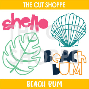
Then I cut out the palm leaf from Beach Bum, also in white cardstock, in a few varying sizes. I backed all the leaves with either a mint leaf paper, or an aqua leaf paper from the MME collection, Palm Beach.
I layered the leaves under the frame and over my photo (which I had sized at 6x6). I also tucked in a few of the die cut flowers from the Palm Beach die cut pack. After adding the flowers, the bottom half of my frame looked really plain! This is where I sort of regretted going with a white frame and thought maybe a patterned paper would've looked better?
Anyway, I decided to jazz up the bottom a bit with some fussy cut palm leaves from a patterned paper, along with my title and some more die cut pieces from Palm Beach.
Thanks for stopping by!
Kira


No comments:
Post a Comment