Tuesday, April 30, 2019

Sun Shiny Day with Joanna Bandelin

Hello friends, Joanna Bandelin here. I've got a bright sunny layout for you, perfect inspiration to get you in the summer mood. 


The first thing I did was cut the Sun Shiny Day cut file out really big. I love big titles and this one is perfect! I chose a bold stripe pattern paper to back the cut file. Since the background is busy I kept the embellishments minimal.


Cutting out the cut file this large makes it super, super easy to back. This whole page came together quickly. 


 Thanks for stopping by, have a wonderful day!


Monday, April 29, 2019

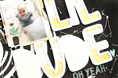
Lil' dude | Sasha Biyanova

Hey everyone!

It's Sasha here today with my layout using two cut files!


The main theme of the layout is made from the Space cadet file! We had some problems with electricity when I tried to cut this file somy plotter had to stop the operation! But I decided to use it any way and divided to the parts)


And I chose The Boy mom cut file for the title! It's simply perfect!


Love how it's going together)))


Hope, you were inspired!
Happy crafting!

Sunday, April 28, 2019

Let’s Go | Iris Fox

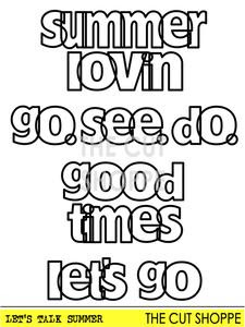
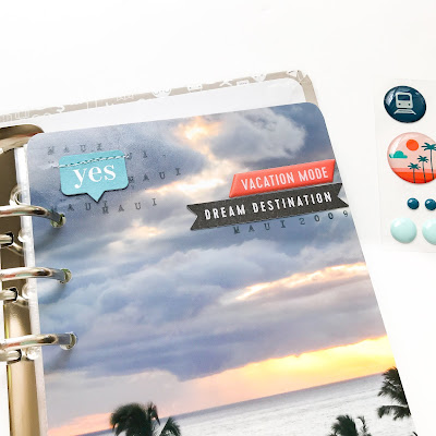
Hello fellow cut file fans! I’m here to share a Traveler’s Notebook sized full photo that features one of the phrases from the Let’s Talk Summer set.

I’ve been on a full photo kick lately and just recently started my Maui travel album.  When thinking about the title page for the album, my mind turned to some of the wonderful travel phrase cut files in The Cut Shoppe.  I’m particularly smitten with the ones that are open alphas, and picked the "let’s go" phrase.  

I printed my photo and cut it down to 4.25 inches wide by 8.25 inches tall. I cut the phrase to the size it actually opens up at, just over 3 inches wide.  This let me place it in the “dead” space at the bottom of my ocean sunset perfectly.  


I backed the letters using 6x6 papers from the Pinkfresh Studio Out and About collection.  That’s one tip - all those 6x6 paper pads we’ve collected work perfectly for backing cut files!  I love that the scale of the patterns gives the smaller letters lots of fun interest.  After adding a few other embellishments from the collection, I realized the white cut file really stood out too starkly.  To tone it down and help it blend with the other embellishments, I stitched the outline in a teal thread.  This was the perfect touch!


Using the Pebbles From Me to You roller stamp, I stamped "Maui" and "2009" in a soft grey to blend in a bit with the clouds. I will note, I’d forgotten the album I’m using is for 3x8, so the TN size was a little wide.  I went back and trimmed the width another 1/8 inch.  Learn from my mistakes people! ðŸ˜‰


Go check out all the fun travel cut files in the shop and try using some cut files on top of full photos.  You’ll love how they really pop!

Thanks for stopping by and pop over to my Youtube Channel to see the process video


Saturday, April 27, 2019

Stay Mine

Hey there. It's  Devra here today. I used the new Shining Star cut file. I had so many different ideas in mind for it. I decided to keep it simple, combining it with Amy Tangerine Stay Sweet creating this soft but bright layout. Look how fun this is!


I knew I wanted to place my photo inside the star. In order for it to fit, I altered the cut file by removing the inner star before cutting. After cutting, I filled the spaces with several different patterned papers. I love all the different sized spaces! I embellished in a few areas, finishing it off with some tonal stitching, just to keep it interesting!


This really is a very easy cut file to use. I may use it again with one of the other ideas I had!


Thanks so much for stopping by today. You can purchase this and all of our cut files in The Cut Shoppe. We always want to see what you make. Share with us in our Facebook Group. See you next time!


Friday, April 26, 2019

Happy | Erica Thompson

Happy Friday everyone! Erica with you today to bring you a colorful layout using the Happy Days cut file!
I knew I wanted a lot of color so I pulled out the new Simple Stories Oh Happy Day collection. I used a lot of different pattern papers from the collection to back the file and I love how it turned out. This file was pretty simple to back. I adjusted the size down a little bit to fit my layout the way I wanted. 


This collection has my favorite colors in it and is just so fun and cheerful! If you haven't really had a look at the whole collection take a minute to do so! The photo I am documenting is from a crop I held in February. We had so much fun and I had a little photo backdrop set up! My good friend Jami and I took some silly selfies and I knew they had to be scrapped! I printed the photo off in black and white so the colors in the photo did not clash with the pattern papers. 

I popped up the cut file with some foam adhesive and then added embellishments around the cut file. I did not add any layers behind my photo for this layout but did do an embellishment cluster off to one side.
 I pulled out this heart epoxy from Happy Scrappin Studio. I thought it was perfect with this layout and I just love adding punches of black!  Here is a look at my completed layout.


You can check out my process video on my YouTube channel HERE! Thanks so much for stopping by today!

Thursday, April 25, 2019

NEW CUT FILES | NYC Selfies

Hi everyone!  It's NEW Cut File day and there are four awesome designs you're not going to want to miss!  We've got designs that can be used for backgrounds, titles or just something to embellish your layout.  I used the new Heart of Glass cut file for my layout.  Hearts always have my heart, so I usually can't resist using them, when I have the chance!


https://thecutshoppe.com.co/collections/new-designs/products/heart-of-glass

When I use a cut file like this, I tend to make it as big as possible for the background of my layout and back it with patterned paper.  I did back the cut file with patterned paper, but instead of one large heart, I used three of varying sizes.  I used the Dear Lizzy It's All Good collection for this layout, and I backed the two smaller hearts with a single patterned paper from the 6x8 paper pad.  For the largest heart, I backed each of the open sections of the outside of the heart shape with different patterned papers.


Since I planned to have a lot of color on my layout from the patterned papers, I decided to use White cardstock for the background.  I also used White cardstock for cutting the cut file.  Sometimes the cut file can blend into the background when you do this, but some hand stitching helps define the design.  I used a chain stitch to give a little bit more texture to the stitching, and used Yellow, Pink and Teal embroidery floss.


I changed my photo to Black & White, because I always love the contrast it adds.  Then I fussy cut some flowers from one of the 12x12 patterned papers, and layered them under my photo.  I also created another cluster on the right hand side of the layout with more of the fussy cut flowers.  The rest of my embellishments were from the sticker sheet and chipboard phrase sticker sheet.  I wanted to keep the title small and add it around the hearts.  The Exclusive Puffy Sticker Alphas from the Hip Kit Club April 2019 Kits, were perfect for my title.

You can find all of the NEW Designs in The Cut Shoppe store!  Head over and grab your favorites!!

https://thecutshoppe.com.co/collections/new-designs
   
https://www.instagram.com/ashleyhorton75/
 

Wednesday, April 24, 2019

Family Is Here With You | Mixed Media Layout With Theresa

Hello lovelies, Theresa here today with an awesome mixed media layout using the Shining Star cut file!


I was inspired to create a boy layout and I had a photo of our son Addison, standing on the foundation of our home as it was  being built in 2014. Here is my layout I created.


I began my layout using Vicki Boutin mixed media paper and my Dr. ph Martin India inks in Cherry Red, Turquoise, Golden Yellow, and Orange. I dropped inks on the page, one by one, sprayed with water, and then lifted the ink off the page using paper towels to get the colors and depth of color I wanted. I then cut the cut file from a blue patterned paper from Paige Evans' Horizon collection, and I cut my photo in the star shape to fit in the center.


I added a very simple embellishment cluster on one side of the photo, plus a journal tag. I also punched some hearts and stars from other patterns in the Horizon collection and used those as additional embellishments.


To create a visual triangle on the page, I added an embellishment cluster at the top of the page. I punched more shapes from patterned paper - this time clouds - to create the cluster. I also stamped a bit of pattern and a word stamp using a Pinkfresh Studio stamp set to help ground the cluster.


For my title I used the puffy stickers from the Horizon collection. They are adhered on the far left of the layout, forming the third point in the visual triangle. The cut file leads your eye to all three points in the triangle, the rays from the star direct you right to each cluster. 


This was such a simple layout, thanks to the excellent design of the cut file! I hope you are inspired to use this cut file and be sure to share with us when you do! See you again soon!


Tuesday, April 23, 2019

Here & Now | Marsha Farris

Hey friends!  Marsha here today sharing a spread in my traveler's notebook.  I used the beautiful Butterfly Wings cut file from the The Cut Shoppe.


I thought this cut file would pair perfectly with the gorgeous colors in the Cocoa Vanilla Studio Happiness collection.  To begin the page, I cut out the cut file using white cardstock.  I backed the file with a few different patterned papers- it's always worth the extra time it takes to do this!


I chose to document a photo of my family, taken on Easter this year.  I thought it worked well with the cut file and the colors in this collection.   I layered some patterned papers and crepe paper behind the photo, and used ephemera, sentiment stickers, and puffy stickers to embellish around the photo.


For the title, I used some stickers in a fun brush font.  I layered them over a tag and added a few more stickers to complete this area of the spread.

My layout came together so quickly using this fun cut file!


Thank you for stopping by today!  I hope I have inspired you to use one of the amazing cut files available at The Cut Shoppe on your next project!


Monday, April 22, 2019

girl power | orange gearle

Hi! Orange Gearle here with a layout using the Floral Wreath cut file and some pretty papers by Paige Taylor Evans. Here is a look at my layout!


Here is the file that I used:


When I cut the file, I cut the full wreath, but I also cut and pasted a few extra flowers so that I could have a few single flowers to use as embellishments! 


I backed the cut file and the extra flowers with pink, blue, and orange papers. Then I added some more flowers from the floral die cuts.


I used a couple of butterfly punches to add some butterflies to my layout as well. 


I did a little mixed media behind the wreath. I first put some gesso on my card stock, then I added some Shimmerz paints over the top for a watercolor look.


I really like how this one turned out, this was such a fun file to work with! I also made a process video if that's something that suits your fancy!


Thanks so much for stopping by! See you again soon! XO o.g.