Saturday, October 31, 2015

A Very Hulky Halloween

Happy Halloween, everyone!  Missy back with you today.  I'm so excited to share my newest layout with you...it's a Halloween page using the awesome Wicked Fun cut file.  I used the spider web and resized several of them and then welded them together to make a background design.


I used the Crate Paper After Dark collection for this layout.  I cut the spider webs on white cardstock and then spritzed them gold with Heidi Swapp Color Shine.  I love how they turned out!  I wanted to try something different then black, and the gold was perfect.  I used some white gesso on the background first and then came in with gelatos to add some blue.  I used some Shimmerz Creameez in Just Peachie to add some light orange splatters.  I love the light blue added in...it makes this layout seem light and airy instead of dark and scary.


Look at that shine...oh my goodness!  LOVE!  I stitched a few times on each web to give them a bit more detail.  I added some light blue tangled thread throughout the page and used some chipboard and stickers (the bats).  Those light blue alphas are October Afternoon Mini Market stickers.


I used the little puffy stickers to create this cute little banner under my title.  I love how the welded web helped me to decided where to put my photos, my embellishments, my title and journaling.  Sometimes repeating the same shape over and over and then welding it together is an easy way to get a layout done pretty quickly because it dictates where everything else can go.


I used the Creameez again on this wood veneer, and I added a few arrow stamps.


Here's a look at this layout being put together.  I hope you enjoy!


Thanks for stopping by, and have a GREAT Halloween!

Friday, October 30, 2015

Mosaic layout

Good Morning.

Fearless here today with a mosaic look layout, I must say I really like the colors and the pattern I have choose for it, so I really hope you will like it too!


I still go back to our holiday in Greece, time gone so quick, I really miss it!


Did you go anywhere this summer?


Products used:


xoxo


Thursday, October 29, 2015

HALLOWEEN BLOG HOP!


Welcome to our Halloween Blog Hop!  We've got some amazing inspiration, cut file giveaways and a $25 Gift Certificate giveaway!  Make sure you visit each designers Blog, because they will be giving away their favorite Fall/Halloween cut file during the Hop, through November 2nd!  And we also have a FREE Halloween cut file to share with you!  Make sure you read all the way down, to download the cut file.

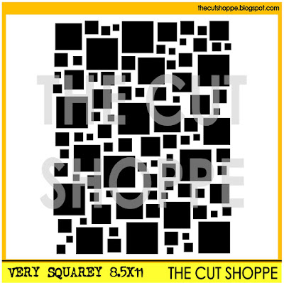
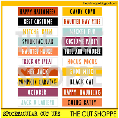
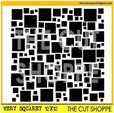
We are kicking things off here on The Cut Shoppe Blog, and I have a layout to share with you using the Very Squarey background cut file and the Spooktacular Cut Ups.  


https://www.etsy.com/listing/250182054/the-very-squarey-background-cut-file-is?ref=shop_home_active_1

https://www.etsy.com/listing/250077647/the-spooktacular-cut-ups-printable?ref=shop_home_active_5

I started my layout with the Very Squarey 8.5x11 background cut file, and enlarged it a bit in Silhouette Studio.  Then I removed some of the squares from the bottom portion of the cut file.  Next I cut it from a Black & White striped paper, and removed the paper from the mat once it was cut, leaving the squares on the mat.  I placed the die cut piece over my background paper and traced some of the square shapes, so I could stitch them with embroidery floss.  Then I placed some of the patterned paper squares from the mat back in place, by using the 12x12 cut piece as a stencil.


The Cut Shoppe is giving away a $25.00 Gift Certificate!  A random winner will be announced on the Blog on November 6th, along with the cut file winners from each of the Design Team members' Blogs.  

TO WIN:  Just leave a comment on this post by November 2nd and tell us your favorite Fall or Halloween activity/tradition!

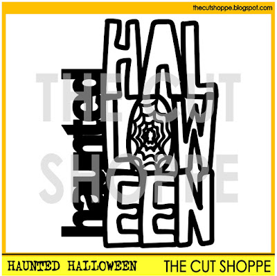
Before you head to our first Designer's Blog, we have a Free Cut File to share with you!  Just click on the image of the Haunted Halloween cut file to go to the Download page or click HERE
https://app.box.com/s/x6u08fy9r1amfqs8hbt8qhrc83gnabu7

Now, it's time to continue on the Halloween Hop!  Here is a Blog Hop list for you to follow...and don't forget to comment on each Blog for the chance to win the cut file being given away by our Design Team!
 
Enjoy the Hop!
Supplies: Very Squarey Cut File & Spooktacular Cut Ups:  The Cut Shoppe; Patterned Paper, Chipboard, Enamel Dots, Bits & Wood Veneers:  Crate Paper; Color Shine:  Heidi Swapp; Thickers:  American Crafts; Die Cut Machine:  Silhouette Cameo
http://www.ashleyhortondesigns.com/
 

Wednesday, October 28, 2015

Autumn

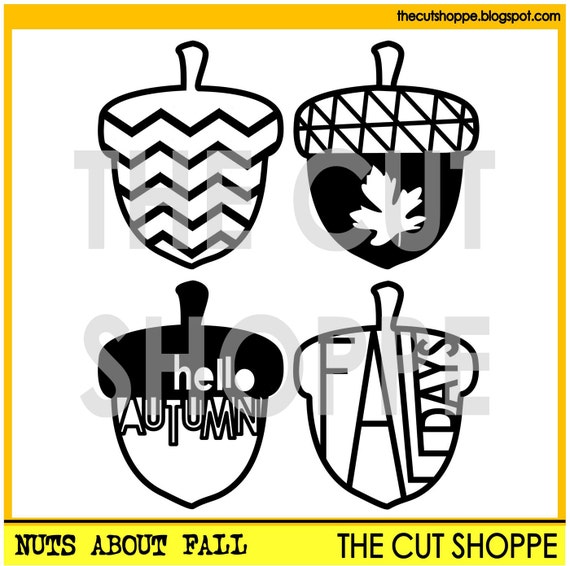
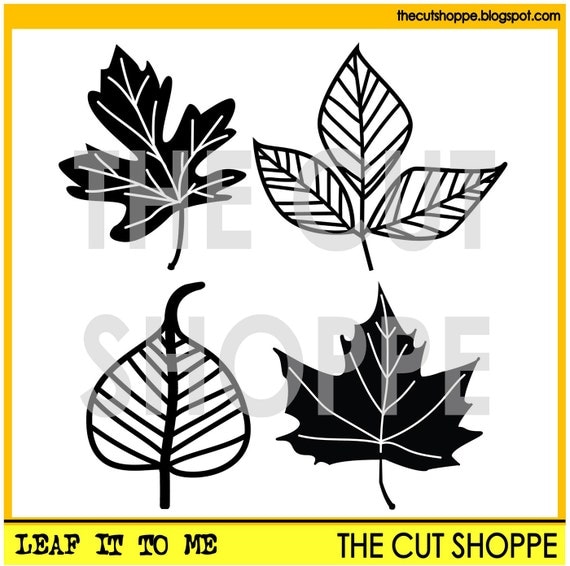
When scrapping fall photos, I love to include leaves in my embellishment choices. They rank right up there with the snowflake-I want them falling everywhere, including onto my layouts! This year though, a new fall motif caught my interest-the acorn! As I've seen them pop up in paper collections and here at The Cut Shoppe, I have been itching to put them on a layout and I did just that this past weekend using the Nuts About Fall cut file along with the Leaf It To Me cut file (I couldn't quite part ways with my leaves!)

The Nuts About Fall cut file set includes 4 acorn images, that can be used for your scrapbooking and papercrafting projects.

The Leaf It to Me cut file consists of four leaf images, that can be used on your scrapbooking and papercrafting projects.

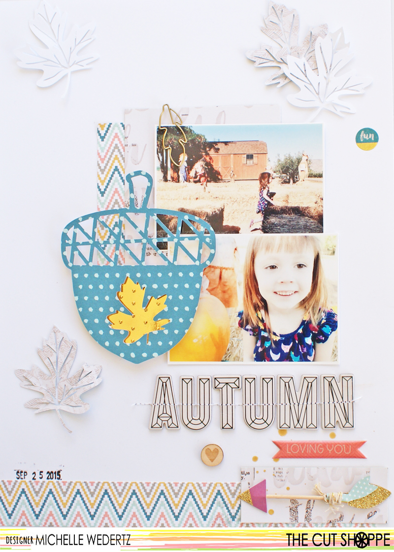
I knew that I really wanted to feature one of the acorns in a big way, so I increased the size of two acorns and cut them out of a bold, blue paper. At this point I wasn't quite sure if I wanted to use one as my title or not, so I gave myself two options to play around with. Here's a look at my final layout:

Autumn

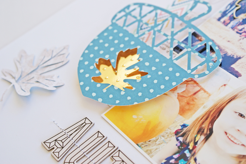
I went ahead and chose the acorn with the leaf cut out of it, backed it with pop dots, and adhered a shiny gold paper underneath. By placing the acorn right there with my photos, the attention is immediately drawn to them.

Autumn 3

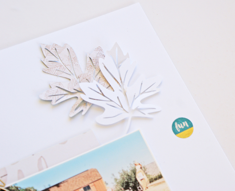
Since I was featuring the acorn, I didn't want my leaves to compete with it. With this thought in my mind, I cut some small leaves out of both white cardstock and a lightly colored patterned paper. This way I could include all of the elements I wanted without overwhelming the page. When placing items such as falling leaves or snowflakes, I will generally follow the triangle rule and place them in three different spots.

Autumn2

Thanks for stopping by today!

The Cut Shoppe

Tuesday, October 27, 2015

The Great Apple Harvest

Laura today, bringing you some Fall fun. As soon as I saw the the Very Squarey file I knew I had to make a stencil from it! I love the mix of squares and that they aren't perfectly laid out, but a bit wonky. I'm all about the wonky. I think it's interesting.

To start off, I placed my newly cut stencil on a piece of watercolor paper and applied heavy gel medium over the entire area. Let dry (I place mine in my oven on warm, but you could let air dry.) then mist with spray inks (I used one color at a time). Once the color is on the page, mist with a spray bottle filled with water. The gel acts as a resist and the ink will wash off or wash lighter, leaving the pattern to pop out of the color. I then took some markers, of the same colors, and traced around some of the boxes. A little splattering of the darker ink finished off the background.

Since the background is so bright and attention grabbing, I didn't need to add much else. I used the Fall In Line Alpha at the main part of my title, adding small letter stickers for the supporting bit of the title. I only needed a few additional embellishments, some enamel dots and a couple of things from the We Are Family from Simple Stories. I loved the letters from the Fall In Line Alpha! I decided to ink with the same colors as I used on my background, only in reverse order, then added black outlines to help them stand out.


https://www.etsy.com/listing/250182054/the-very-squarey-background-cut-file-is?ref=shop_home_active_11


These two files really helped me tell a fun little story in super fun way. Pick them up in the shop 
 today! 


Monday, October 26, 2015

Get To The Point-Yum-O!

Hi friends!  Candace here to share with you a super fun layout using the Get To The Point cut file.

I looooove this cut file!  When I saw this cut file I knew the exact photo that I needed to use.  I recently took this photo of my little guy eating a snow cone.  I couldn't get over his cute little tongue!  So cute!! LOL!  I paired the cut file with papers from the Amy Tangerine Finder's Keepers collection that matched the photo perfectly.  I also used some embellishments from the Let's Eat collection from Elle's Studio.  Here is a look at the final layout.

And a few close ups...


I have also included a process video of this fun layout! 


Thanks so much for stopping by today!  Remember to stop by on Thursday for our Halloween blog hop!  There will be giveaways and fun inspiration!  Have a beautiful day!


Sunday, October 25, 2015

New York New York (so good they named it twice)


Hi everyone, Julie back again today sharing a bright layout made using 2 cut files from the shop, the This Way cut file & the AroundThe World Tags cut file.


First I inked a piece of black cardstock with some gold mist & then cut the This Way cut file out of some patterned paper & laid that over the top backing a few of the openings with more patterned paper, I then cut out more arrows & added those on top of the cut file & stitched them down so that they could be lifted up on both sides to give some dimension.


I added another piece of patterned paper to the top half of the page & added a bit of gold texture paste, through a stencil to that. I layered up some papers behind my photos & added those to the left hand side. I then played with the New York tag, I inked it with 3 different Tim Holtz distress inks & added black & gold splatters & backed it with some black card to make the letters stand out.


I finished the page with some small arrows & a bit of washi tape


Thanks so much for taking a look today & I’ll be back with you next month xoxo


Saturday, October 24, 2015

Sweater Weather

Hi! Irit here and I'm so happy to share this layout I created using some of the new cut files in the store. Here's my finished layout-


I used the Fall Finds cut file for my title.


I cut it out of white cardstock and outlined it with a pencil to give it more definition. For my background I used the 12*12 At An Angle cut file, but I only used a 6*12 strip. You can use the other strip as a stencil!


 I backed the die cut strip with paper from the new Maggie Holmes Shine collection, as well as for my embellishments. Here are some close ups-


There's also a process video-


Check out the Cut Shoppe store on Etsy for lots more fun cut files! I'll be back next month with another project. Thanks for visiting!